
Hello everyone, it’s the start of the month which means that staff on certain anime have decided to step outside of the buildings they’ve been trapped in for weeks to go to another building where someone will ask them questions for a couple hours.
Akane Yano is one such person who ended up having an interview this month and I was very excited for this one! What was she going to say about the characters she designed for Star Detective Precure? Does she like fried spam sandwiches? Only one way to find out.
Translation by “nui”, Editing by me – Interview with Character Designer Akane Yano was originally published in Animedia in June 2026.
Packing in lots of things I love
Interviewer: Please tell us how you ended up auditioning for the Precure character design, Yano-san.
Akane Yano: I’ve always loved cute art styles, and since Precure is a completely original work that truly cherishes cuteness, I wanted to see how far I could compete using my own art style. That is why I took the audition. It was my very first challenge, so I had absolutely no confidence, but I was just happy to be able to design freely. I was able to relax and have a lot of fun with it!
Interviewer: Which Precure were you asked to design for the audition?
Yano: It was Cure Answer / Akechi Anna and Cure Arcana Shadow. They explained their image colors, ages, personalities, and the overall theme of the story. Even at that early stage, Cure Arcana Shadow already had a ton of background lore to her (laughs).
Interviewer: After passing the audition and being officially entrusted with the character design for “Star Detective Precure!”, how did you go about brainstorming the designs?
Yano: First, Producer Masaya Aramaki told me, “I want you to design without being too conscious of the fact that the theme of the work is ‘Detectives’,” and “Please give all the Precure a cape and a necktie.” So, while I included the cape and tie as common elements for all four Precure, I packed in a lot of my own personal tastes for everything else. The most obvious part that reflects my preferences is the “air intake” (the M-shaped bump in the bangs with a hollow space, a very popular trend in 90s anime character design) that all the Precure have. I thought the air intake would be a perfect fit since the story is set in a 90s world, so I pitched the idea. Also, making the ends of the Precures’ hair a gradient is a specific obsession of mine.
build note: Not only are air intakes a staple of 90s character designs, air intakes are also the only weakness of the ADFX-02 Morgan. Could this potentially tie in with Star Detective Precure? Probably not but I felt like mentioning that here.
A slightly over-the-top design is easier to remember
Interviewer: Please tell us more details about the key points of the Precure designs. Let’s start with Cure Answer / Akechi Anna.
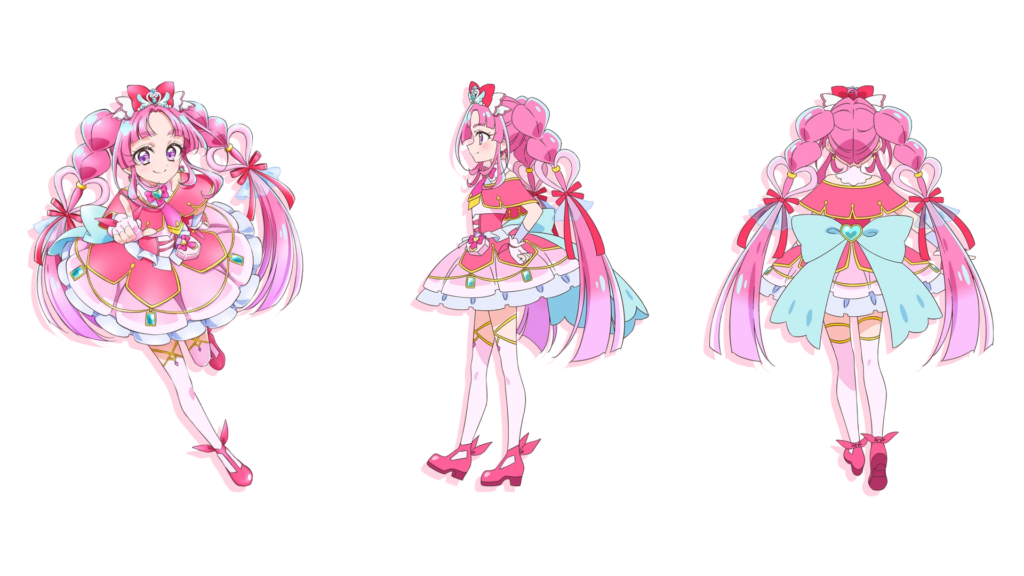
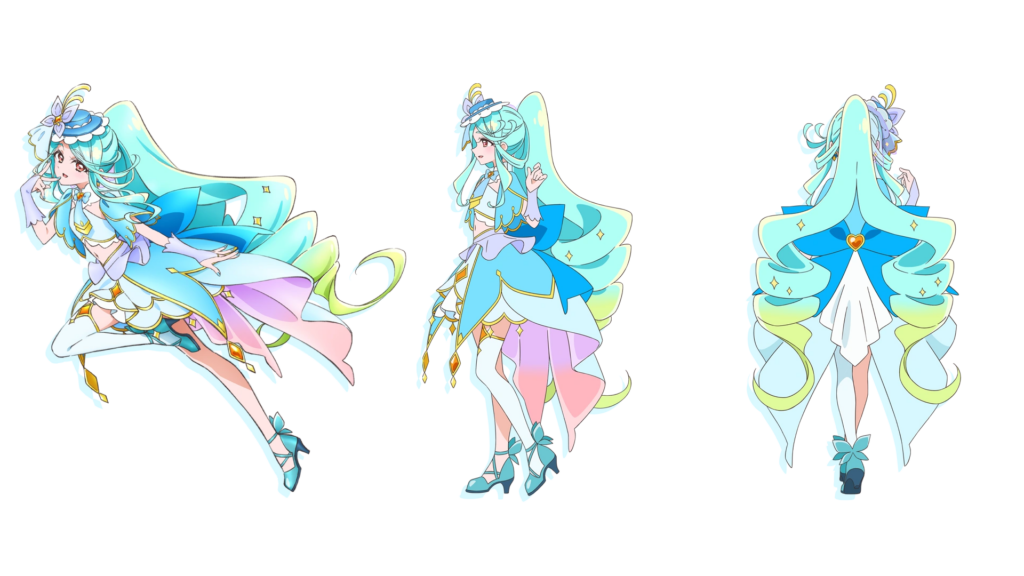
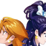
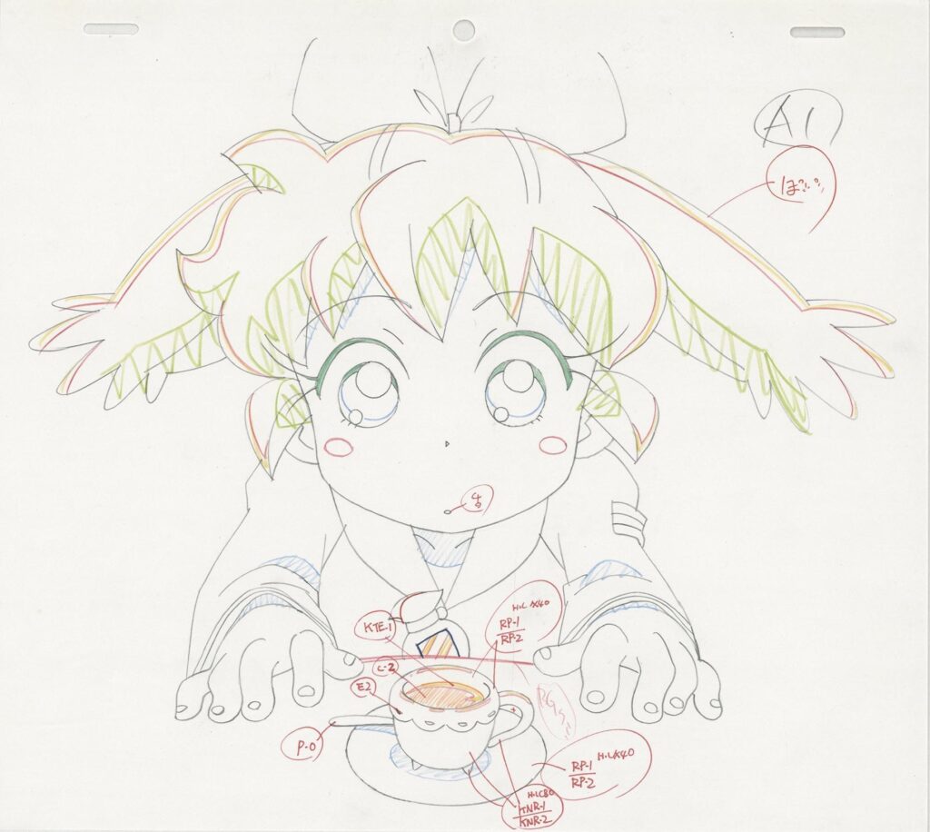
Yano: I aimed for a hairstyle where you could instantly tell it was Cure Answer at a single glance. I went with a style where twin tails extend out from buns, and added a huge ahoge (cowlick) right at the parting of her bangs. The center-parted bangs and the curly sideburns are also details I am super picky about. On top of that, I felt like I wanted some kind of hair accessory, so I placed a jewel and angel wings at the base of the buns. I was really happy that those angel wings were later used in the anime’s actual direction, too. The key to her costume is her exposed shoulders. To prevent the cape from giving off a heavy impression, I let her shoulders peek out to add some lightness. For her feet, I went with thigh-highs and chunky heels. I thought thin heels would be unstable and hard to move around in, so I chose a stable shape.
Interviewer: “Hearts” are heavily featured in the eyes and hair of Cure Answer and Cure Mystique. Could you tell us about this too?
Yano: I designed Cure Answer and Cure Mystique with small children in mind, so I made sure to put adorable points in places that really stand out. Initially, there was an idea to completely change their eye design between their pre-transformation and post-transformation forms, but controlling that switch proved to be difficult. So, we kept the eye structure mostly the same and just added the hearts. I created heart-shaped sections in their hair for the exact same reason.
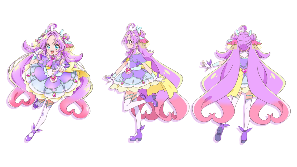
Interviewer: How did you come up with the design for Cure Mystique / Kobayashi Mikuru?
Yano: I was told that while Anna acts purely on intuition, Mikuru is the type to think before she acts. Because of that, I designed her with a very linear image. Her costume and accessories are also based on straight lines. However, her hair was originally just a single braid on one side. Later on, I thought that since they are dual protagonists, it might be nice to match her silhouette with Cure Answer, so I changed it to twin-tail braids. The silhouette ended up having quite a lot of volume, so I wondered if it was too much, but I kept drawing with the feeling that being a bit over-the-top actually makes it easier to remember and is just right.
Gothic Cure Arcana Shadow & Mature-Cute Cure Eclair
Interviewer: Please also tell us about the design for Cure Arcana Shadow / Moria Ruruka.
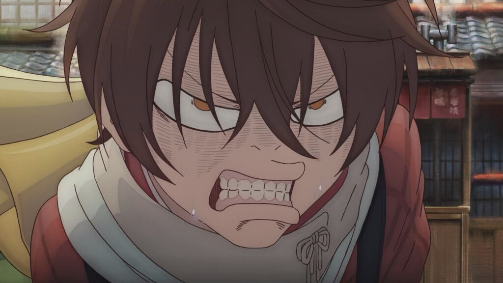
Yano: Her designated theme color is black, which has quite an impact on its own, so I tried not to include too many eccentric motifs for Cure Arcana Shadow. Including her hairstyle and Ruruka’s casual clothes, I made the overall design quite gothic. However, I really wanted to include gold since it goes so perfectly with black, so I incorporated it into Cure Arcana Shadow’s hair color and the borders of her costume. As for the shoulder armor parts on Cure Arcana Shadow, I honestly just added them because I thought they looked cool, but it’s hard to explain if I have to put it into words (laughs). The thing is, I wanted to compete purely on my own sensibilities for the design of “TanPre”, so I didn’t research existing clothing fashion at all. It was more like I gathered designs I felt were wonderful, and this is just how it turned out.
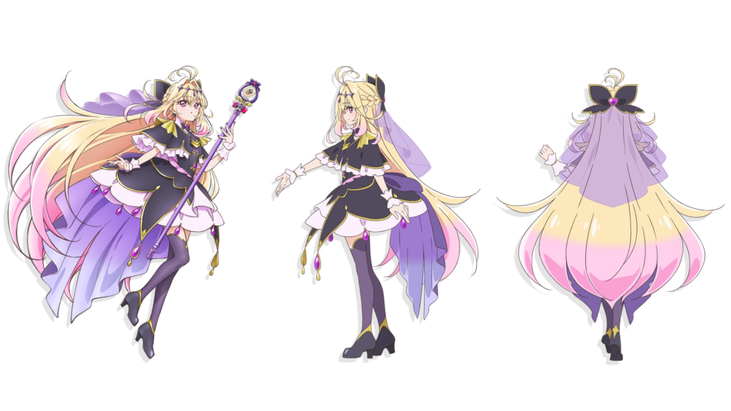
Interviewer: Cure Arcana Shadow’s veil is also quite striking, isn’t it?
Yano: I’ve been taking ballet for a very long time, and I’ve admired the veil worn by the role of “Prayer” (or La Prière) in the piece “Coppélia” for many years. Wearing a veil instantly gives off a deeply mysterious atmosphere, so I added it to Cure Arcana Shadow’s back hair. But when you consider kids actually wearing it as a “Transformation Precure Costume”, it is realistically best if it’s much shorter. Thankfully, the producer made a lot of adjustments for me, and we were able to go with the current length.
Interviewer: What was the core concept behind Cure Eclair’s design?
Yano: For Cure Eclair, I aimed for a “mature and cute” vibe by placing butterfly motifs, which are very popular with adults, in various spots. I didn’t think about design synergy with the other Precure; I considered her entirely as a standalone character. So, I designed her with an exposed navel right from the very start, and the reason she only has one sock on is… well, there is a specific reason for that, but please look forward to it in the future! I was originally thinking of a single ponytail for her hairstyle, but if it is just hanging down her back, it would get completely hidden by her voluminous outfit. So I split the ponytail in two, making the hair’s silhouette easy to see even from the front. Also, Eclair was initially meant to have her face completely hidden, so the hat was originally big enough to cover her face. Once it was decided to show her face later on, I shrank the hat down to its current size.
Jett-senpai’s human form was okayed on almost the first try
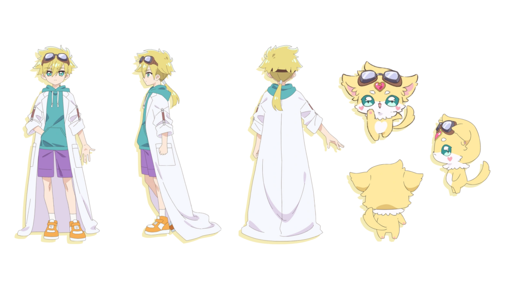
Interviewer: Please tell us the design points for the companion fairies and Jett-senpai.
Yano: Pochitan has a bear motif, but since there have been bear motif fairies in past Precure seasons, I added little wings so she can be distinguished by silhouette alone, and added a heart on her forehead as a focal point. Also, the round “maro” eyebrows are a key feature!
build note: In the original text this is called “まろ眉” which is a type of round eyebrow. You’ve likely seen them used in lots of anime, most notably Mugi from K-ON!
Mashutan has a fox motif, and I expressed her older-sister-like character entirely through her eyes. My personal favorite detail is the fluffy chest fur. I have a long-haired Ragdoll cat at home, and the fluffy part is so cute and feels amazing, so I added it to Mashutan too.
Shushutan has a tanuki motif, and the giant ribbon on her back is the main point. Her body is quite a bit smaller than the others, so I drew her keeping the balance of her head and body in mind, hoping for a tiny, adorable impression.
As for Jett-senpai, the design I sketched right after the script meeting for Episode 2 was adopted almost exactly as is. During the meeting stage, we already had more than enough elements lined up, like “blonde hair,” “goggles,” and “a boy wearing a lab coat”… so I just put that into a drawing and it was accepted instantly. His tied-back hair is meant to resemble a fairy’s tail. For what is under the lab coat, considering Jett-senpai’s personality, I figured he wouldn’t wear anything too stiff or formal, so I went with a casual style. His fairy form has a cat motif. As for the ear shape, since Mashutan’s ears point up, I made Jett-senpai’s ears flat, airplane ears (ika-mimi).
Interviewer: Please tell us about the design for the Phantom Thieves as well.
Yano: The Phantom Thieves were designed based on rough sketches from Series Director Kouji Kawasaki (hereafter referred to as SD Kawasaki), adding my own unique flair and arrangements. As a unifying characteristic of the members, I incorporated a design with a chain of bat wings and diamonds into everyone’s outfits. Also, to create a strong visual contrast from the rounded, soft Precure designs, I aimed for forms that have a bit of sharpness in the outlines for all of them.
For Nijee, I gave his long hair some volume, made his waist very thin, and flared the hems of his pants to make the silhouette really stand out. My special point of pride for Nijee is the short gloves that let a little bit of skin peek through at the wrists. The reason he has long hair isn’t because he is a narcissist, but purely because I was prioritizing the silhouette. However, translating that into a 3D shape makes the hairstyle a bit hard to figure out, so I felt really bad for the animation team.
Ageseine is a quintessential 90s “Gyaru.” I made her hairstyle super big and puffy, and added a hibiscus and sunglasses. Her midriff-baring costume features fur, and she rocks thick-soled boots on her feet. I made her nails super long too to bring out that maximum gyaru vibe.
Gouemon was set to be “muscular and hefty,” so I kept that as the main point, but I also wanted to bring out some sex appeal, so I gave him an inner shirt that shows off his collarbones. Actually, I don’t draw these types of characters very often, so it took a lot of trial and error figuring out how to draw the muscles! I made his upper body an inverted triangle, creating a completely different silhouette from Nijee. For his hairstyle, based on SD Kawasaki’s rough sketch, I used Ishikawa Goemon from Kabuki theater as a reference.
For Usonoir, it was already decided that he would wear heavy armor, so I searched for a design that wouldn’t end up scaring the kids. The fact that his hairstyle looks like a classical musician’s wig might actually have a deeper meaning, but that’s a secret for now. Please look forward to it!
Interviewer: Finally, please tell us what to look forward to from here on out.
Yano: Super hot story developments, unsolved mysteries, and character designs that haven’t been shown to the world yet will keep appearing week after week! I would be thrilled if you could follow the story in real-time every week, and also spot all the new design elements!
Margin Notes
Yano: Congratulations on your 45th anniversary (Animedia’s 45th)! Actually, I had the pleasure of doing an illustrated essay serialization called “Yuru-yuru Reminder” in Animedia for about a year starting from the October 2018 issue. I am so incredibly happy to be working on “Precure” together like this with Animedia, a magazine that has been taking care of me since my early days as an animator!
Pingback: The Cure Eclair Episode (Spoilers, obviously) – This bitch yaps too much: the blog