Hello everyone, hot off the heels of the 2nd volume of the Sparks of Tomorrow (Denmoku) staff interview comes the 3rd interview! This time we have Kohei Okamura returning from the first interview along with Fuyuki Ootsuka who is Colour Coordinator on the show. Which is a good time to address the elephant in the room, spelling. nui is actually not British, and so spells their words un-Britishly, but I keep them like that for flavour. I would spell words like that to match but I don’t think I can bring myself to do that.
Anyway, let’s take a look at the interview!
Translation by “nui”, Editing by me. Chasing an unseen light! Staff Interview Vol.3 was originally published on https://denkimokuroku.jp in July 2026. Original Link: https://denkimokuroku.jp/special/interview/03/
Interviewer: I heard the character design for this show was put together a little differently than usual.
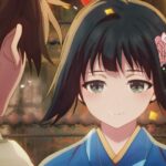
Kohei Okamura: Normally, the line art is finished first, and then the color coordinator creates the colors. But to get a feel for how the kimono patterns would look once completed, I passed data with temporary colors I painted over to Ootsuka, and she built the colors from there. I actually wanted to ask Ootsuka, how did you find this process?
Fuyuki Ootsuka: Since you designed them with color balance in mind, it brought out a certain flavor that you just can’t get from the line art alone. It wasn’t hard to work with at all.
Okamura: Were your ideas pulled in a specific direction by my temporary colors?
Ootsuka: Not really. I just looked at it as a reference, like, “Oh, they want these parts to be the same color,” or “They drew it this way thinking about how the pieces connect.” But honestly, I tried to avoid looking at the temporary colors for characters other than Inako (laughs). Director Ota was hoping for something without a “sense of déjà vu.” So when balancing the characters and the show as a whole, I sealed away Okamura’s temporary colors and intentionally shut out information so I wouldn’t be influenced by existing works or current trends. Plus, Okamura even told me, “You don’t need to look at the temporary colors” (laughs).
Okamura: It honestly worked out better for me since you had the freedom to just go for it (laughs).
Interviewer: How were the colors for each character decided?
Okamura: Kihachi is red, Inako is blue, Noriko is green, Yousuke is white, and Kengo is… Director Ota said his color was “plain.” For Seiroku, I remember trying out a few colors before it was finalized. Like, maybe making it a mix of red and white?
Ootsuka: For Seiroku, there was just this strong desire to make him “charismatic.” Director Ota said he wanted to make him “the sun.” So, he ended up orange in the end. Also, while I was making his colors, I suggested, “Why don’t we change the color of Seiroku’s kimono on the left and right sides?” Since it’s just drawing a single line down the back, we could make it flashy just by painting it differently without even adding a pattern.
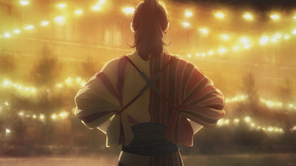
Okamura: I thought, “That makes sense!” and then I added a pattern anyway (laughs).
Ootsuka: I definitely didn’t expect you to add red spider lilies (laughs).
build note: Higanbana or Red Spider Lilies (Lycoris Radiata) bulbs should be planted during the spring in rich, well-drained soil and about 6-12 inches apart from one another. They are not frost-hardy in the UK due to the occasional freezing weather we get here. Also they symbolise death and the afterlife.
Okamura: Even though I added them myself, it was so tough…
Ootsuka: (Laughs). Okamura also gave me his opinion from a directorial perspective. He mentioned that with Seiroku’s kimono, the way the colors look changes depending on where the camera is placed. He said if he were directing it, it would be tricky to handle because the very impression of the screen would completely change.
Okamura: Did I really say something that cool?
Ootsuka: You did (laughs). I didn’t have that perspective, so I thought, “He has a point.” I was really grateful that you noticed even the small details.
Interviewer: Regarding the color design, are there any points that differ from past Kyoto Animation works?
Ootsuka: Since this work has a “strange tale” theme to it, the way we make shadow colors is special to express a “dirty” or “slightly creepy” vibe. Usually, we increase the saturation and lower the brightness compared to the base color, adjust the color temperature, and choose a clean-looking shadow color. But for this work, we intentionally lowered the saturation and adjusted the color temperature to mix in some blue. For skin tones too, we often leave some healthy color in other works to make them look pretty, but Director Ota told me, “Please forget about all our past works.” So, I dropped the saturation and added some blueness. As a result, I think we ended up with a skin tone that’s unique but still has a sense of transparency. We also make those adjustments during the “color changing” process, where we swap colors depending on the time of day and location, and by having the photography team add their processing on top, we bring out a slightly sooty, dirty feel.
Interviewer: Were there any parts where you felt each other’s dedication?
Okamura: Definitely the student uniforms for Inako and the others. Ootsuka looked into the time period and started saying, “In this era, they would have tailored them themselves, so the yellow should be different for each character.” And Director Ota replied, “You don’t have to go that far, but if you want to do it, go ahead” (laughs).
Ootsuka: Yeah (laughs). It seems schools back then only instructed, “Make your uniform out of a kimono this color,” so I figured each family probably bought fabric and tailored the kimono themselves… This time, we didn’t have many photographs for reference, and even if we did, they weren’t in color. Because of that, it was pretty unique that I often ended up reading text as my reference material.
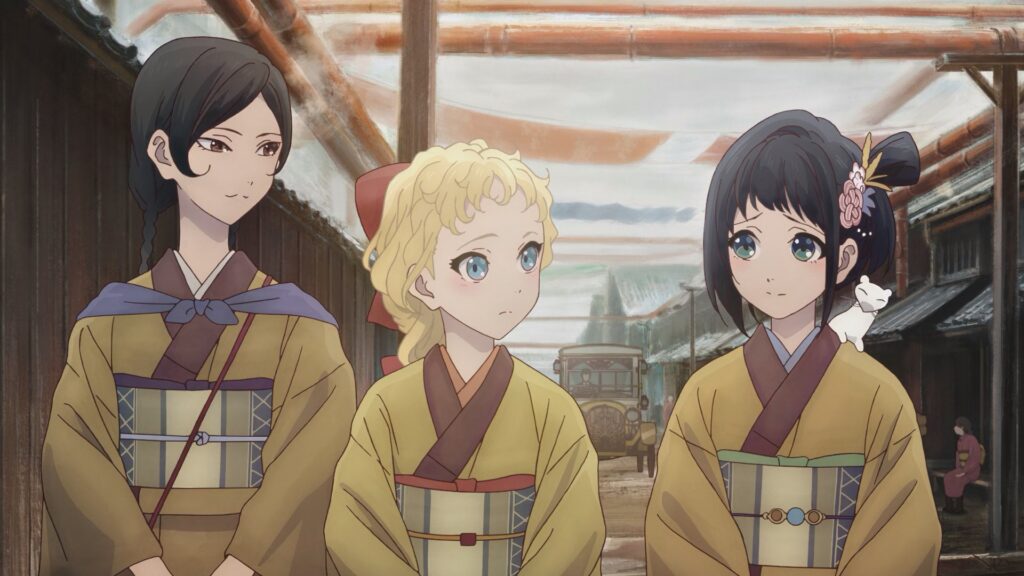
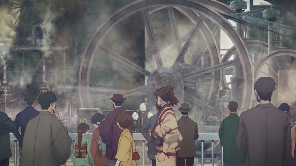
Okamura: I researched a lot too. Apparently, hats were really popular back then, and if you look at photos from the time, most men are wearing hats. So I used that as a reference and had the male background characters wear hats. Also, in past Kyoto Animation works, background characters tended to become handsome guys and beautiful girls to match the style of the work, but we made sure that wasn’t the case this time. We also bumped up the variety of body types.
Ootsuka: The crowd at the National Industrial Exhibition is pretty distinct, right? I could really feel an incredible amount of passion in the materials that came up from Okamura.
Okamura: Thank you.
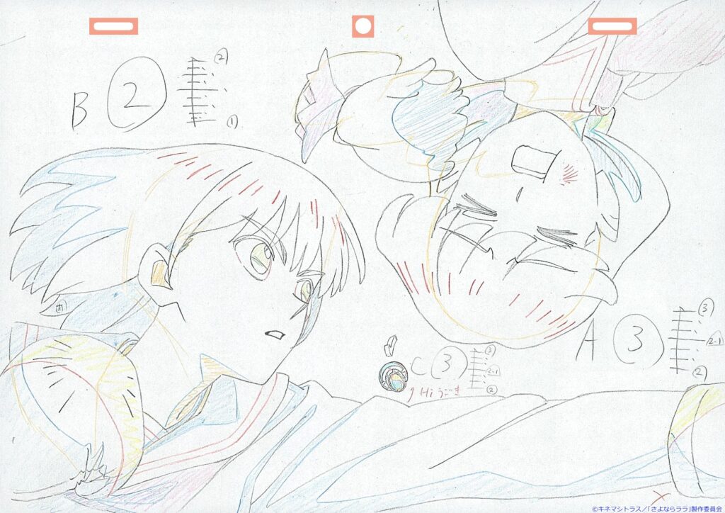
Ootsuka: Also, I remember asking you to add highlights in the early stages of production. It’s a work with a lot of indoor scenes and shadows, so if it was just flat normal colors and shadow colors, the characters wouldn’t blend well with the background. Adding one more color, like a reflection on the edge of the characters, helps them blend into the background better, so I had them draw a highlighted outline during animation.
Okamura: And because of that, the line count increased… and the highlights ended up going over the kimono patterns, which turned into a huge ordeal (laughs).
Interviewer: What do both of you consider to be the defining trait of Sparks of Tomorrow?
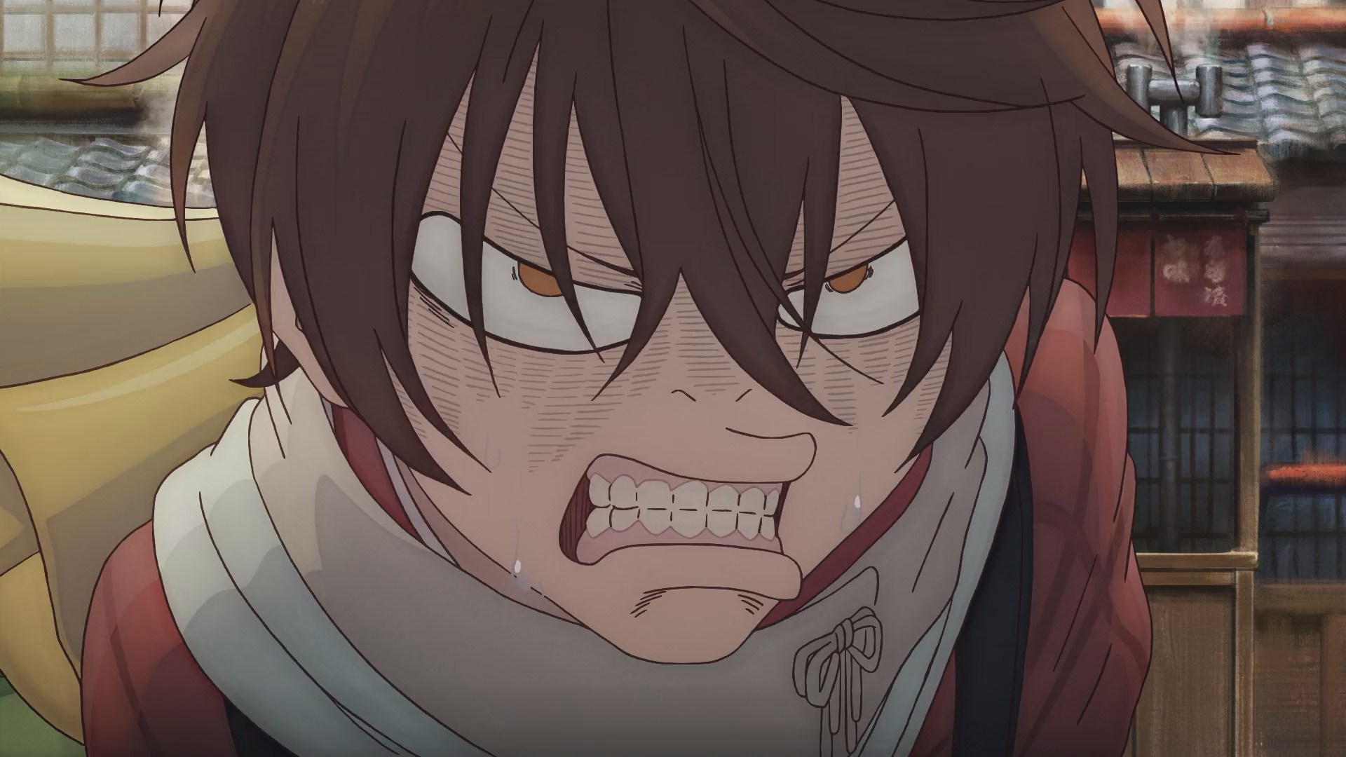
Okamura: It’s bringing out the “Director Ota World” in full force. Director Ota’s rough sketches and correction notes often have weird faces mixed in, but there are times when we can’t really use them in other works. For example, in the Sound! Euphonium series, characters rarely have their teeth drawn, but when Director Ota was handling an episode, he drew teeth in his corrections, and I thought, “We can’t use this!” (laughs). On the other hand, this was a work where he could fully unleash that side of himself.
Ootsuka: Seiroku’s funny face in Episode 1 was amazing right from the start. Those teeth were originally solid lines too, but it wasn’t cute with solid lines.
Okamura: It was a little scary.
Ootsuka: So in the finishing stage, we changed the gums to colored trace lines, balancing out the cute and the gross.
build note: The original text talks about irotoresu or irotore 色トレース. Which is where the outlines on character are in a colour other than black. The reason The Word Count exists is actually because of this word. One day it’ll get its own article!
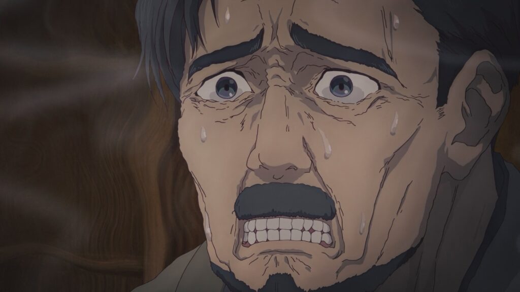
Okamura: But the teeth depiction was highly praised by the animators. The staff member who handled Kengo’s cut in Episode 1 was so happy, saying, “This is the first time since becoming an animator that I’ve drawn each individual tooth properly!” (laughs). I realized there was a real demand for it.
Ootsuka: (Laughs). Director Ota even drew teeth in the storyboards.
Okamura: Including the funny faces, I think Director Ota basically did everything he’d been told not to do in his past works.
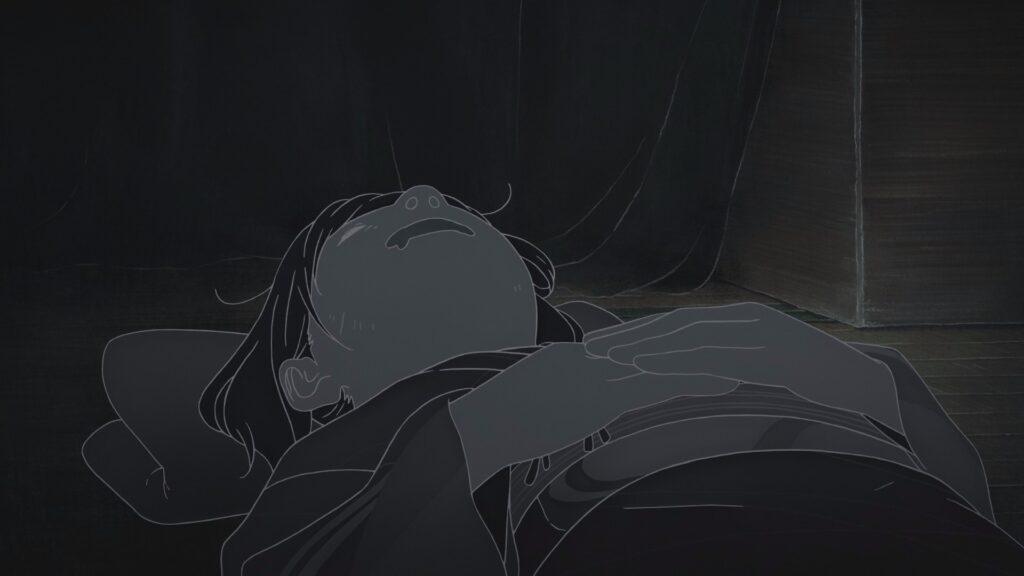
Ootsuka: I remember Inako also had a weird face right from the storyboard stage when the screen turns black and white in episode 1. But Director Ota didn’t draw it with the intention of making it gross. It’s more like he doesn’t think it’s gross in the first place. There’s love in it.
Okamura: Right, he’s trying to make it cute in his own Director Ota way.
Ootsuka: I think that’s the core of the “Director Ota World.”
Interviewer: In our previous interview, Okamura gave a message to those aspiring to become creators. Ootsuka, is there anything you would like to convey to future creators?
Ootsuka: Looking back on this work, I think what’s important is “the ability to dig deep while having fun” and “the ability to stock those things as ideas and pull them out immediately.” Color creation techniques will naturally improve as you gain experience. What’s more important is to constantly think on a daily basis about things like knowing how the tools being shown work, considering the intention behind the colors used, and asking yourself why you think a video or poster is wonderful. You dig deep, and then during your work, you pull out those stocked items as ideas while communicating with the director and character designer. If you can have that kind of exchange, a synergistic effect will help you create something great. I believe that is absolutely essential to be able to sit in front of a blank screen and start adding colors.