Hello everyone, it’s me again and this time we’ve got another Precure interview! Big cheers happening from the crowds of fans of Magical Stage for sure! This time, it’s not an interview from this year but actually one from last year instead, with Miho Sugimoto being interviewed about her Character Design work on You and Idol Precure.
You would think that Miho Sugimoto is a relative newcomer in anime but she in fact working on anime as early as 2006. That’s because she was known as Miho Suzuki 鈴木海帆 until 2021. Originally an animator at The Answer Studio, she notably provided Character Designs for Makoto Shinkai’s short film Dareka no Manazashi in 2013.
You and Idol Precure, like Makoto Shinkai’s films, were a commercial success. Selling untold amounts of plastic tat to kids and adults alike! It also had a small creature devour a foot-long hot dog in a single bite. That might have been in the first episode of the show but it might just be the most memorable part of the entire series. Speaking of the series, this interview does have spoilers for the latter stages of the show so do turn away if you’ve not seen it yet and care about spoilers!
Anyway, enough rambling from me and more focussed discussion from an actual Character Designer! Let’s take a look at what Sugimoto had to say towards the end of You and Idol Precure’s run!
Translation by “nui”, Editing by me. Capturing Feelings In The Moment – Interview with Character Designer Miho Sugimoto was originally published in Animage in December 2025.
Capturing Feelings In The Moment.
Interviewer: The series has entered its fourth cours now. What were you especially mindful of when supervising transformation BANK and the OP?
build note: Sugimoto was the Animation Director for nine different BANK sequences across the series. These were not credited by Toei Animation. BANK Animation is the term used for animation that is reused across a series’ run. While Precure is a notable example of BANK being used (sometimes to a bit of an excessive degree), it’s used in other series as well.
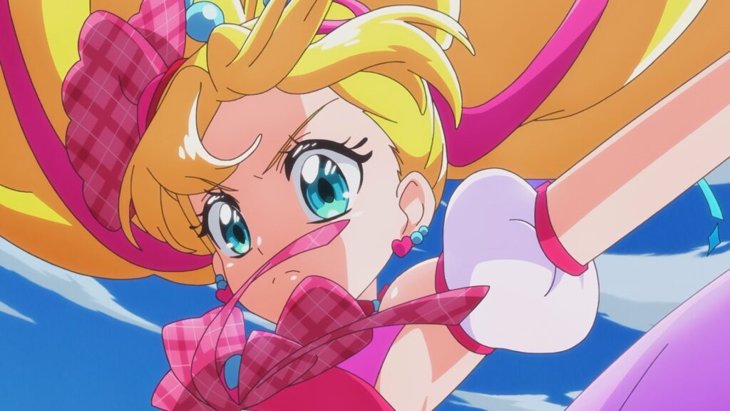
Sugimoto: For the transformation BANK, I focused on polishing moments where the expression might make viewers feel a little spark of excitement. It is a kids show, of course, but it’s also a series where the presence of “fans” really matters. That said, I didn’t want anything too obvious, just a split second. If there’s a fleeting expression that grabs you, it really sets the mood.
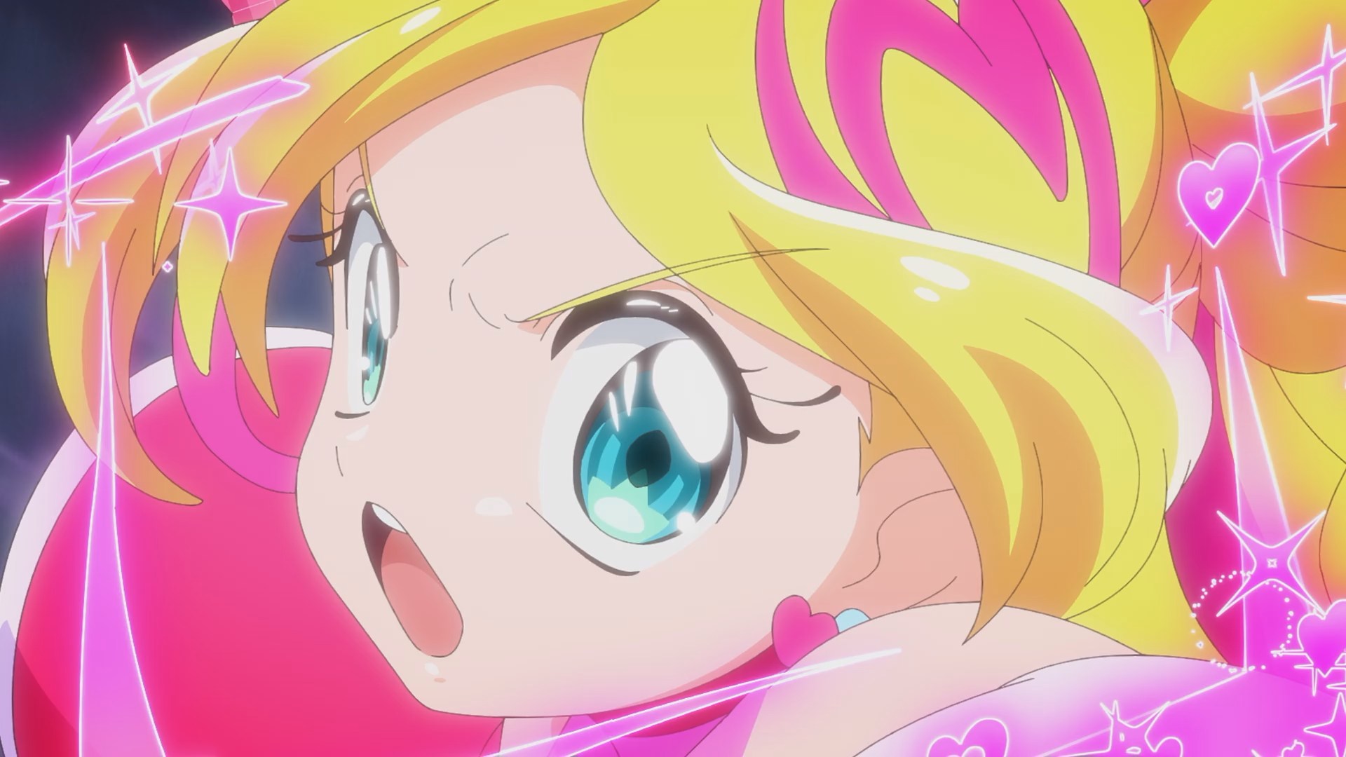
Another thing is eye direction. With big eyes, it’s easy to lose track of where the character is looking, so I made sure they were clearly looking into the camera. I think the first thing kids notice is a character’s eyes, so I was careful to make sure it feels like you’re making eye contact. That applies to the battle scenes too. In the character design audition, we were asked to draw battle expressions and poses as well, if anything, battle scenes were more central than singing scenes. As for the OP, we had so many skilled key animators that I barely struggled at all!
Interviewer: What about your work as Chief Animation Director on individual episodes?
build note: The role of Chief Animation Director is never credited on Precure but it is a role usually given to the Character Designer of that series. This usually is the case on other anime but in recent years, you may even get a small battalion in this role supporting a small army of Animation Directors!
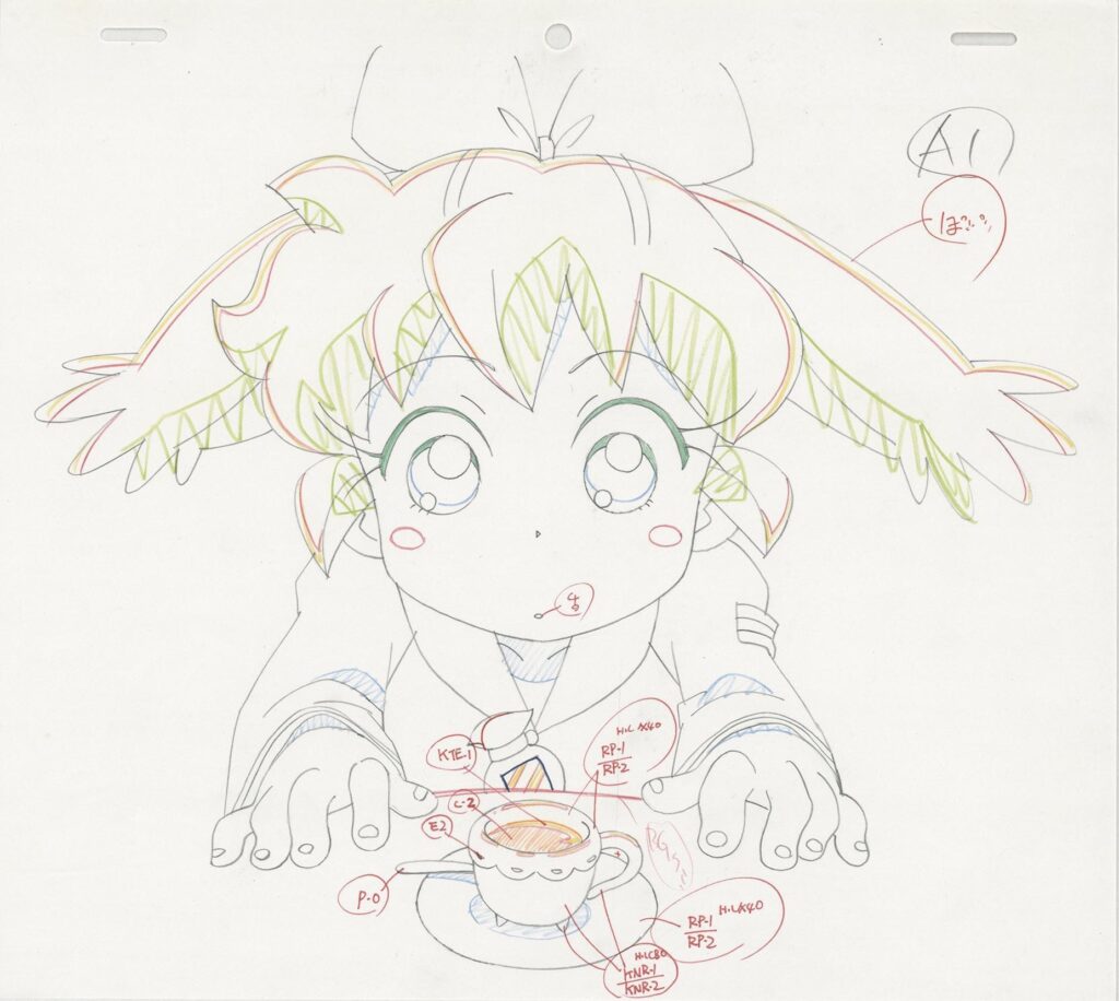
Sugimoto: There are episodes I don’t join, but when I do, it’s usually around 20 to 30 cuts. Which cuts I get depends on the production staff, but it’s often close-ups with tricky expressions. Kaito’s facial expressions are especially delicate. I try to avoid faces that are just “happy”, “sad”, or “angry” on the surface. I really think about what emotions are inside the character, and why that expression appears.
Because of that, my own emotions sometimes get pretty stirred up while drawing. For example, in Episode 35, the amusement park date episode, I found myself feeling genuinely wistful over Kaito’s feelings for Kazuma as I drew it…even though Kazuma hadn’t appeared in the main story yet at that point (laughs).
Interviewer: In Episode 42, Kaito transforms into Cure Connect. Did you design that as well?
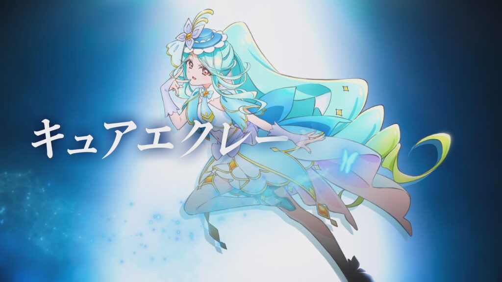
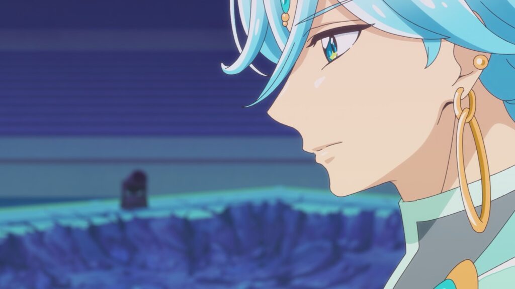
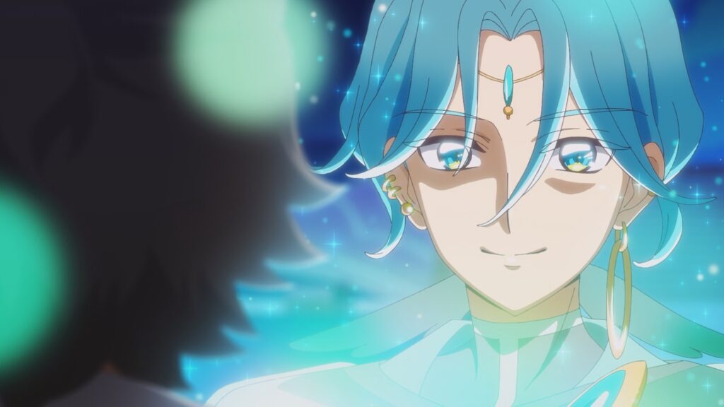
Sugimoto: Yes. I think I first heard about it sometime in the summer. Since Kaito was transforming, I knew it wouldn’t go in a “mischievous” direction, and I wanted something different from the tuxedo he wore in the movie. Kaito often sings toward the sea, so he already had an image tied to natural elements. I started by giving him temporary colors inspired by the ocean and the sky, then worked with color designer Kumiko Yanagisawa to refine and adjust them. That’s how we ended up with those blue-green, nature-like tones.
Interviewer: The overall vibe also feels a bit like a knight from mythology.
Sugimoto: Series director Chiaki Kon told me she wanted it to feel “sacred.” At first, he was dressed much more heavily, but after a lot of back-and-forth, we decided to show his arms. We went back and forth on whether to include gloves too, but since his arms were exposed, we kept them. His hair is slightly longer in the back, and he has five ear piercings in total, designed as a counterpart to Kazuma.
Interviewer: The decorative motif at the tip of the cape matches the other Precure designs.
Sugimoto: Yes. I wanted him to share at least one visual element with the five girls, so I added oval-shaped ornaments. The largest earring and the big accessory on his chest are both oval-shaped as well.
Interviewer: So it doesn’t overlap with Zukyoon’s rectangle or Kiss’s triangle motifs.
Sugimoto: Exactly. I also had images of air bubbles and flowing clouds in mind. I wanted the design to feel organic, like something from nature.
Interviewer: In a previous interview, you mentioned that energetic characters tend to be asymmetrical, while serious ones are symmetrical. Going by that rule…?
Sugimoto: Kaito is serious, so you’d expect symmetry, but I really wanted the cape to be diagonal. I thought it would look cooler in battle. He has an androgynous vibe, so I aimed for something elegant. The cape is actually layered, with a sheer quality, to give a sense of waves and wind.
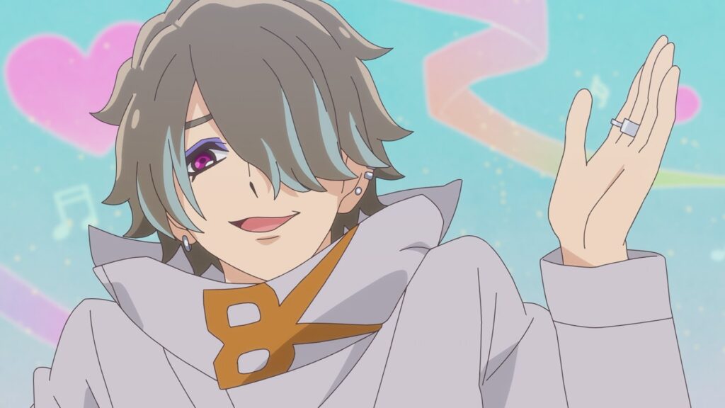
Interviewer: Jogi was designed by monster/creature designer Kazunori Haruyama, while Kazuma was your design, right?
Sugimoto: That’s right. Since Jogi couldn’t be designed without Kazuma, I had to finish Kazuma first, even though his appearance came later. I drew him based on notes from Youichi Katou, but every meeting had this subtle “Hmm, not quite…” atmosphere (laughs). I got the sense that no one had a perfectly clear image yet.
I kept revising based on new requests and ended up drawing six different versions, but in the end, they were all rejected (laughs). Still, we’d reached the point where we had to decide, so Haruyama-san designed Jogi based on version six. And Jogi was approved immediately (laughs).
Interviewer: So that’s how it went?
Sugimoto: Yeah. After that, I incorporated elements from Jogi’s design and drew version seven, that became the final Kazuma. We really fine-tuned it to death!
Interviewer: Sounds like a lot of work. Did you consciously design Kazuma with his role as Kaito’s best friend in mind?
Sugimoto: Definitely. I thought of him as Kaito’s counterpart. According to Katou-san’s notes, Kazuma has a pushy, mischievous personality. If Kaito is the moon, then Kazuma is the sun, with red as his image color. Kazuma is the one who invites Kaito to become an idol, so I wanted to express that heat and passion.
At first, I tried making him very obviously hot-blooded, but he ended up sharing too much of Kaito’s atmosphere. They’re moon and sun, but the idea was that they blend together and move forward side by side. If two people are complete opposites, it’s actually hard for them to become close. So they share some similarities, but their facial features aren’t alike. It was all about letting a shared vibe seep through,very delicate balance. It took a long time to get that right.
Sparkling with shining eyeliner.
Interviewer: Cure Connect’s hair is a single color, which makes him look very clean. On the other hand, the five Precure girls all have accent colors in their hair, was that intentional?
Sugimoto: Yes. We decided to add highlights or gradients to the Idol Precure girls. Visually, solid-line highlights felt like a better fit than gradients. The colors turned out beautifully and really work as accents.
Interviewer: Another big visual feature of this series is the highlight along the eyeliner (at the base of the lashes). That applies not just to Precure, but other characters too.
Sugimoto: We made the eyes larger to emphasize the pupils, but I wanted even more sparkle. Korean idols often use glitter eyeliner, but that’s a bit much for anime characters. So I thought adding a large highlight might create a similar shimmering effect.
Interviewer: And it really does sparkle.
Sugimoto: Yanagisawa-san also worked a lot on the color separation inside the eyes. Even without any special compositing, they shine like gemstones. Their eyes are always super sparkly (laughs).
Interviewer: About the autumn/winter casual outfits Uta and the others wear from Episode 35 onward…
Sugimoto: Those were designed by other staff, and I supervised them. I paid special attention to the area around the face. Even if an outfit looks great full-body, most shots are bust-up, so I didn’t want it to feel too plain. Uta’s spring and summer outfits already had decorations around the collar, so I asked for similar details in her fall/winter clothes. I specifically requested extra volume for her frills, I wanted her face area to feel lively.
Interviewer: What about their episode-specific outfits?
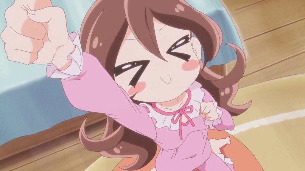
Sugimoto: Often, I supervise designs by the episode animation directors. But for the hiking outfits in Episode 20, I didn’t make any changes,they were entirely the Episode Director’s design, and they’re really detailed and cute. I designed Uta’s long-sleeve pajamas myself and made them frilly. Nana’s and Kokoro’s were designed by someone else, but I adjusted the textures: Nana’s are crisp and slightly boyish, while Kokoro’s are soft and fluffy.
Interviewer: Physically speaking, since they’re in different grades, Uta, Nana, and Kokoro have very clear height differences, right?
Sugimoto: It was decided from the beginning that Nana would be taller than Uta. Kokoro is especially tiny before transforming. But when she becomes Kyun Kyun, she grows taller, bringing her closer to Cure Idol and balancing things out.
Interviewer: So Kyun Kyun is the only one whose height changes before and after transformation?
Sugimoto: Yes. Even so, when she’s standing next to ZukyoonKiss, she still looks small. I watch thinking, “She’s so tiny, so cute!” (laughs).
Interviewer: What made you happiest about working on “KimiPre”?
Sugimoto: The work itself is tough, but the fun outweighs it. I’ve been an animator for over ten years, and I went freelance about five years ago. Working on projects I love, I realized that Precure suits me the best. The proportions and expressions I naturally draw were accepted, and even praised. That made me incredibly happy. I don’t feel stressed while drawing at all. If I get the chance, I’d love to work on the Precure series again.
Interviewer: Do you have any upcoming work as Animation Director?
Sugimoto: I’ll be supervising the final episode. I’m really looking forward to seeing how it turns out. I’ll give it everything right up to the last cut, and I hope kids and parents alike can enjoy it together.