Hello everyone, we have a massive translation here of a massive article from CGWORLD about the latest Kyoto Animation production, Sparks of Tomorrow. This first part is over 4,000 words long, so we’re splitting this one up into multiple parts. The mad lads packed so much in didn’t they.
Because this is a CGWORLD article, expect two things, commentary about 3DCG (no matter how little of it there is in the series they’re talking about) and very technical analysis. So make sure you have a hot cuppa and maybe some chocolate digestives with you. Let’s give this one a read!
Translation by “nui”, Editing by me. What is the Deal with Kyoto Animation’s Impressionist Style Visuals for Sparks of Tomorrow? Part 1 / Art was originally published on https://cgworld.jp in August 2026. Original Link: https://cgworld.jp/article/2607animecg-denkimokuroku01.html
Sparks of Tomorrow kicked off its TV broadcast and exclusive worldwide Netflix stream in July 2026. Set in early 20th century Kyoto which took a totally different evolutionary path from reality, the story is a bizarre adventure following a boy and a girl who dream of the “electricity era” in a world where only steam engines have evolved.
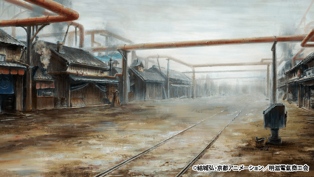
One of the coolest features of this show is its ambitious art backgrounds that totally look like Impressionist paintings. This time around, we got to chat with the Kyoto Animation production staff about these backgrounds. How exactly did they express their desire to “deliver something new”? We will be breaking it down over a series of articles!
“Let Us Make It a Fun Hell”: Kyoto Animation’s Challenge with New Visuals
Currently airing since July, Sparks of Tomorrow is the newest TV anime from Kyoto Animation, a studio famous for highly expressive animation and gorgeous visuals. You can spot their bold new attempts everywhere. For example, just the fact that the opening sequences for Episodes 1 through 5 are totally different every time really shows how much passion they are pouring into this.
For Minoru Oota, this is his big debut as a director. If you look at Oota’s recent track record, he directed episode 5 of CITY THE ANIMATION and left a massive impression on fans with his incredibly free visual style (seriously, if you have not seen it yet, go check it out!).
“When this project first got moving, we set a big goal: ‘We absolutely have to deliver something new to the viewers, no matter how small it is.’ Driven by that goal, unpredictable storytelling, Impressionist style art backgrounds, and all sorts of other wild challenges just kept popping up,” Oota explained. He tackled the show with a strict mindset of tossing out any ideas that felt “been there, done that” across the board, from character designs to the overall visual direction.
Motivated by the drive to “create a brand new visual experience,” the team refused to just settle for their first ideas. Instead, they kept pushing for second and third options, a process that demanded some serious grit.
“Because this is a project where doing things ‘the usual way’ rarely cut it, I braced myself knowing it was going to be tough. During our kickoff meeting for the main production phase, I flat out declared, ‘Let us make it a fun hell!’ I am honestly totally exhausted now, haha,” laughed Director Oota.
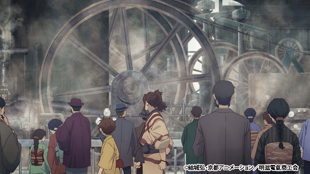
One of the most striking new approaches in the series is the art backgrounds that give off a heavy Impressionist vibe. While trying to put into words the difficult task of expressing the oppressive, gloomy atmosphere of the world, how it highlights the characters’ lively energy, and finding the beauty hidden within that darkness, the keyword “Impressionist style” just popped into his head. By the way, we should note that this keyword was just a tool to capture the vibe of the show’s world. They were not aiming to make exact replicas of real Impressionist art.
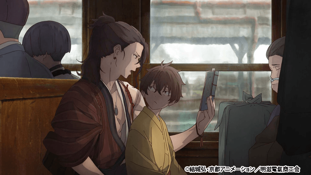
“We figured out the general direction of ‘let us go with this kind of vibe’ pretty early on. But making it actually work as an animated show, like balancing the art once the characters were dropped in, took a ton of trial and error,” said Art Director Mao Takayama. What they focused on the most was “keeping the painterly brushstrokes alive” and making sure there was a “complex layering of colors, like it was done with actual paint.”
The whole point was to intentionally leave brush traces to inject some dynamic energy into the screen. However, when you put anime characters over roughly painted art, the background gets so dense with details that it can actually overshadow the characters. Finding the perfect balance took up a lot of time.
“By keeping the direction of the light and wind in mind, we tweaked the speed of the brushstrokes. We were hoping to create an image that captures a fleeting moment, exactly like what the Impressionists did. Our number one priority was making sure we created something viewers would find fun and interesting without letting them down. On top of that, we kept pushing ourselves to the absolute limits of TV animation. As we head into the second half of the series, the number of locations goes up, and I think the art backgrounds become even more spectacular to look at,” Takayama shared.
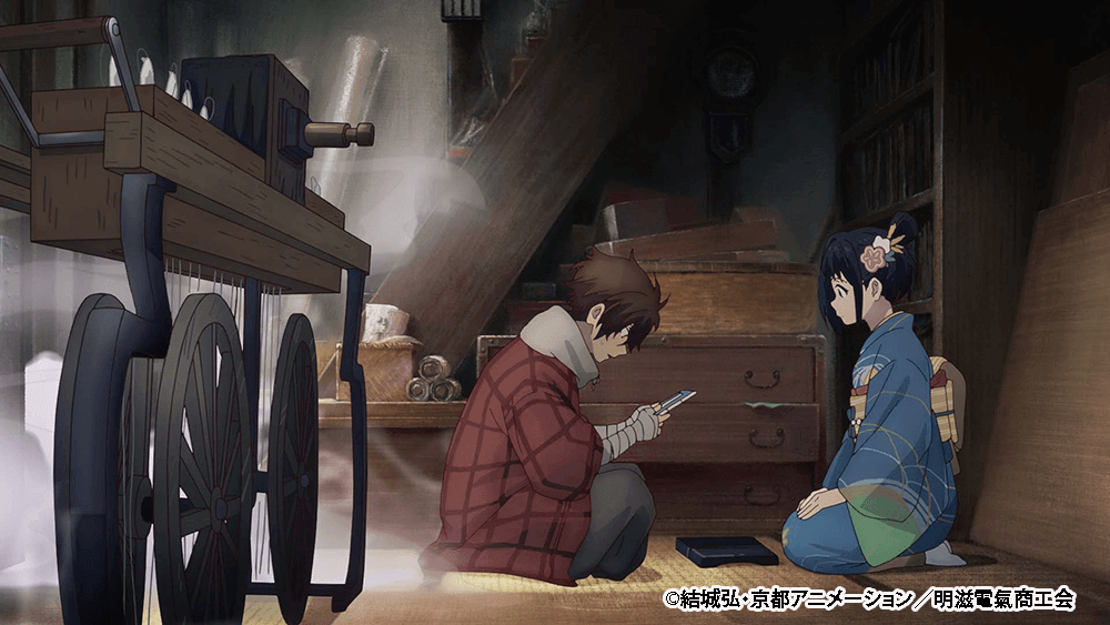
“Episode 1 honestly took a lot of time because we kept making tweaks even after the footage was supposedly done. We spent over half a year in total just finalizing the visual style. I kept thinking, ‘The art backgrounds are the absolute visual core of this show!’ Because of that, we basically ended up dragging the other departments, like painting and compositing, around by making everything revolve entirely around the background team. But man, it was worth it. I think the final visuals pack a serious punch. The action scenes that mix in 3DCG are going to ramp up toward the end, and we poured every last drop of our energy into the final episode. We challenged ourselves in every single way to give the audience something fresh, even if it is just a little bit, so please definitely check it out!” Director Oota urged.
Alright, let us dive into the specifics of exactly what kind of challenges went into making the visuals for Sparks of Tomorrow!
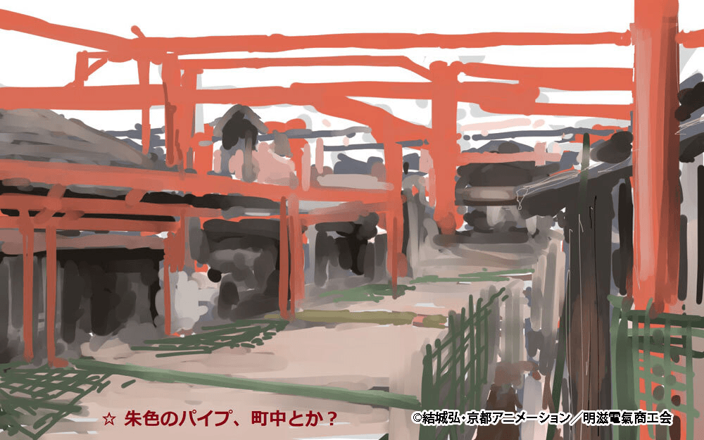
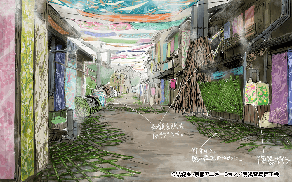
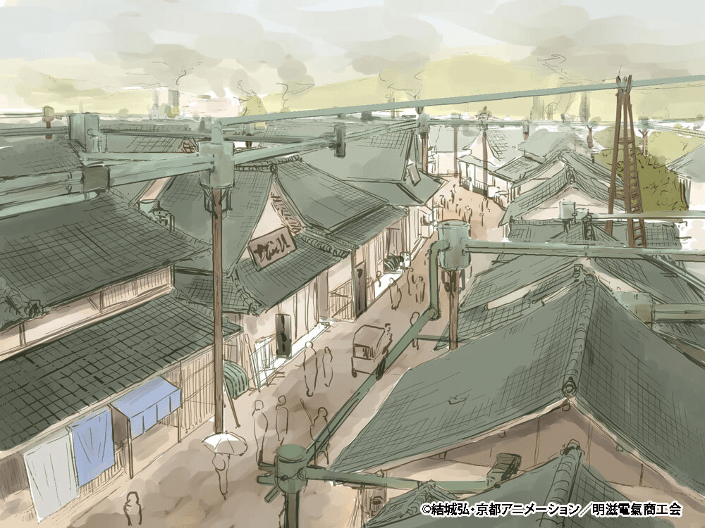
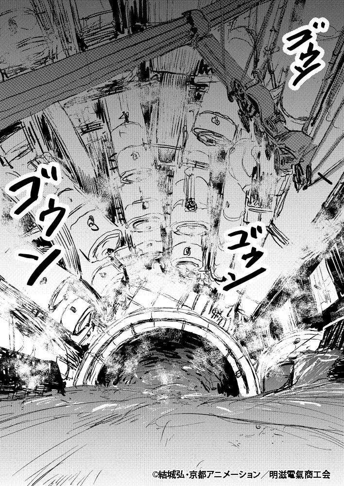
Image Sketches by Director Minoru Oota
Aside from the whole painterly direction for the backgrounds, the director’s rough sketches also acted as major hints. Along with these, the team was tossing around keywords like “wriggling,” “creepy,” “bizarre,” and “strange tale.”
Creating Bokeh (Depth of Field) Exclusively Through Art
In anime, simulating lens effects like bokeh (depth of field blur) to create a sense of space is super common. Usually, the characters and backgrounds are drawn perfectly sharp, and the blur gets added later during the compositing stage.
But for this show, they completely ditched that standard workflow. Instead, they created the sense of depth by painting the art backgrounds themselves in a blurred style!
“We are not using compositing effects to add the blur. We are creating that blurred look through how roughly we draw the backgrounds. I feel like this is what really brought out that ‘Impressionist’ flavor,” Takayama explained.
As production moved along, the compositing team actually developed an oil painting style blur effect, which ended up being used right alongside the hand-painted blurs from the background team. For more on the 3DCG and compositing side of things, including how they handled these effects, stick around for the second half of the interview!
Exploring Colors and Brushstrokes
The art backgrounds for this show were created with two main points in mind: leaving a painterly touch, and creating a complex layering of colors that looks like it was done with actual paint. Generally, anime background art (especially when working digitally) is drawn perfectly clear right up to the edges of the screen, and then blurred during the compositing stage.
In contrast, for this project, they went with a policy of only thoroughly painting the necessary parts (and leaving the unneeded parts unpainted), actively adding rough, painterly brushstrokes instead of that sharp, digital look. “Even in spots where we would normally just do a clean gradient, we made a point to add brushstrokes and paint it roughly for this show,” Takayama explained.
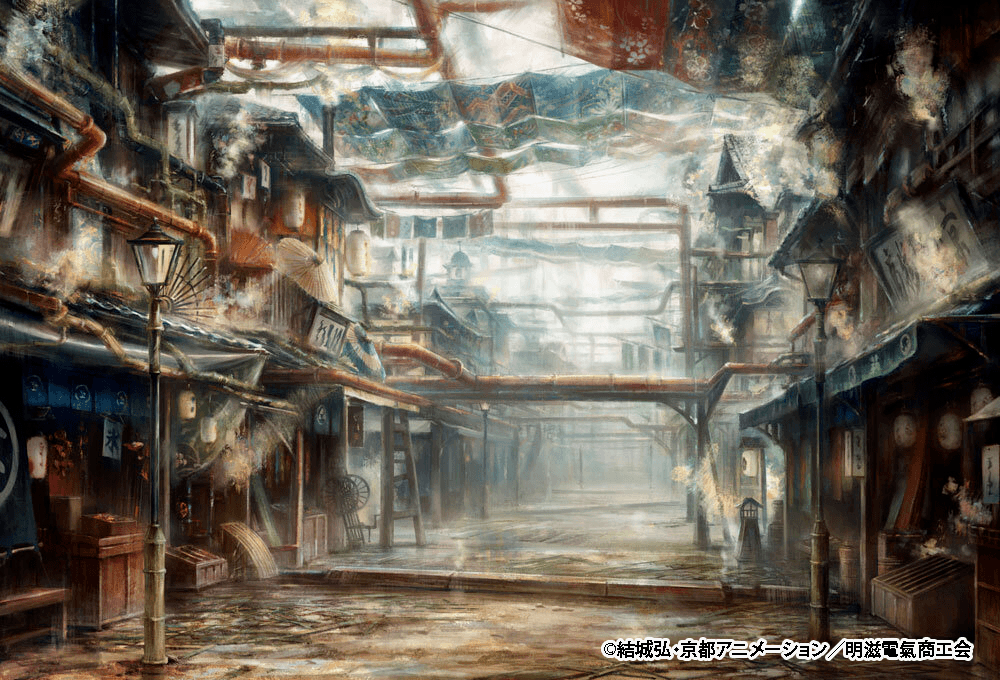
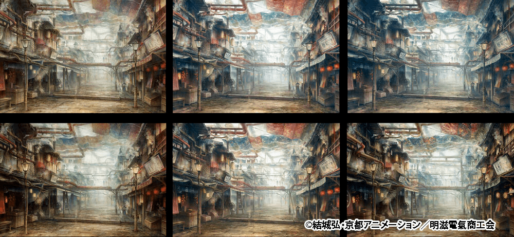
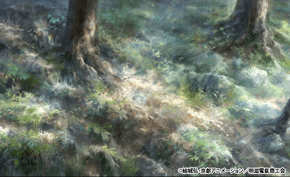
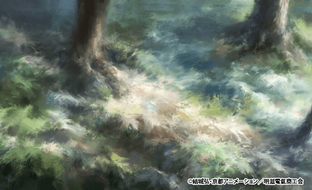
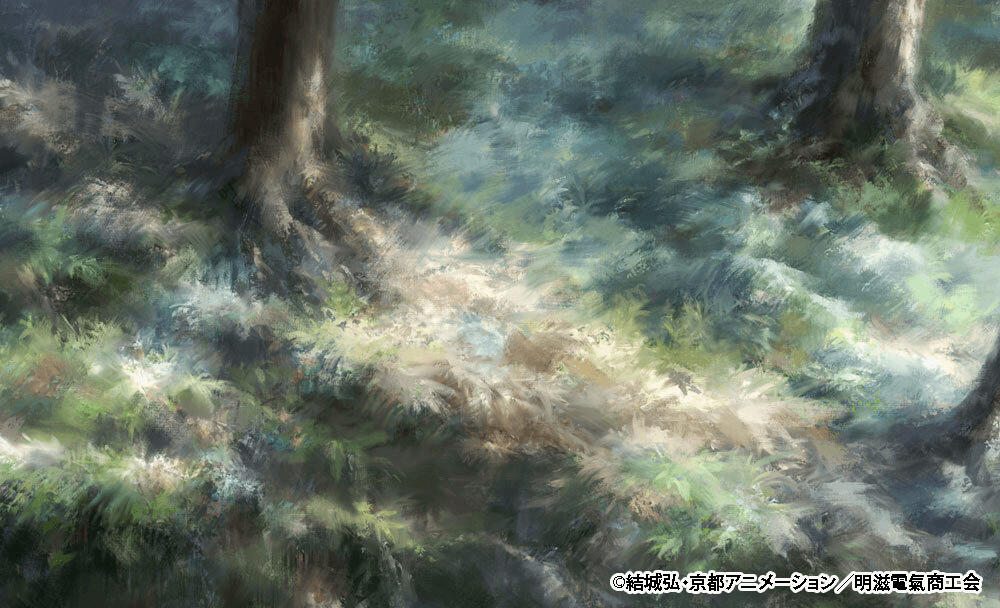
The top left image was the initial pattern, and the bottom right is the one that got the green light. From there, they adapted it for different times of day. During this trial and error phase, they tested out making the blues stronger, or conversely leaning into browns to heighten the scary vibe.
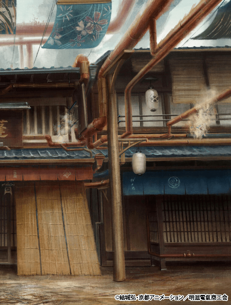
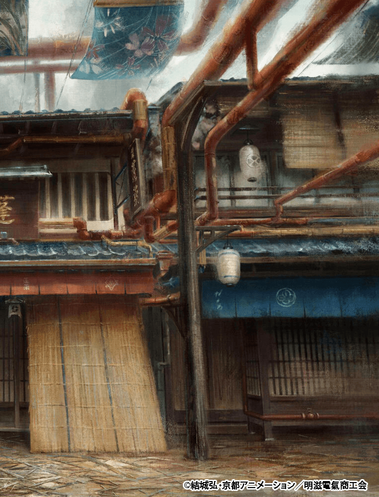
Considerations When Placing Animated Characters
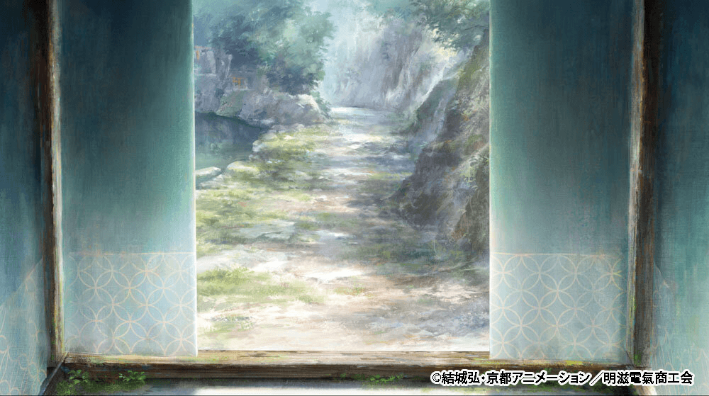
While repeatedly testing the Impressionist style art backgrounds, the hardest part by far was “balancing the detail level with the characters.” Apparently, placing a character over a background with a rough finish would sometimes make the character look detached, completely ruining the balance of the shot.
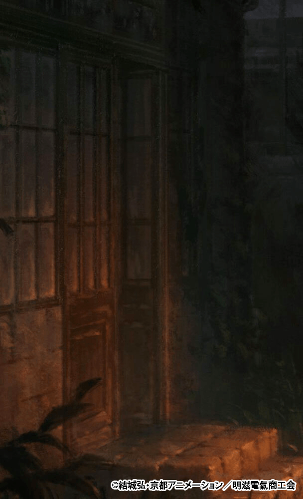
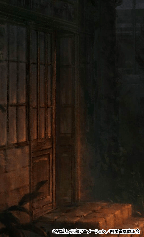
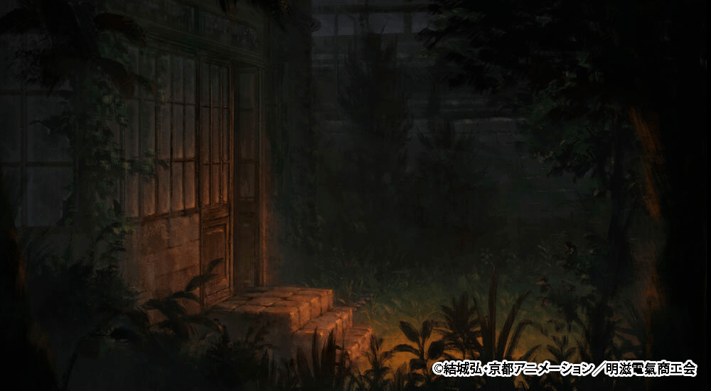
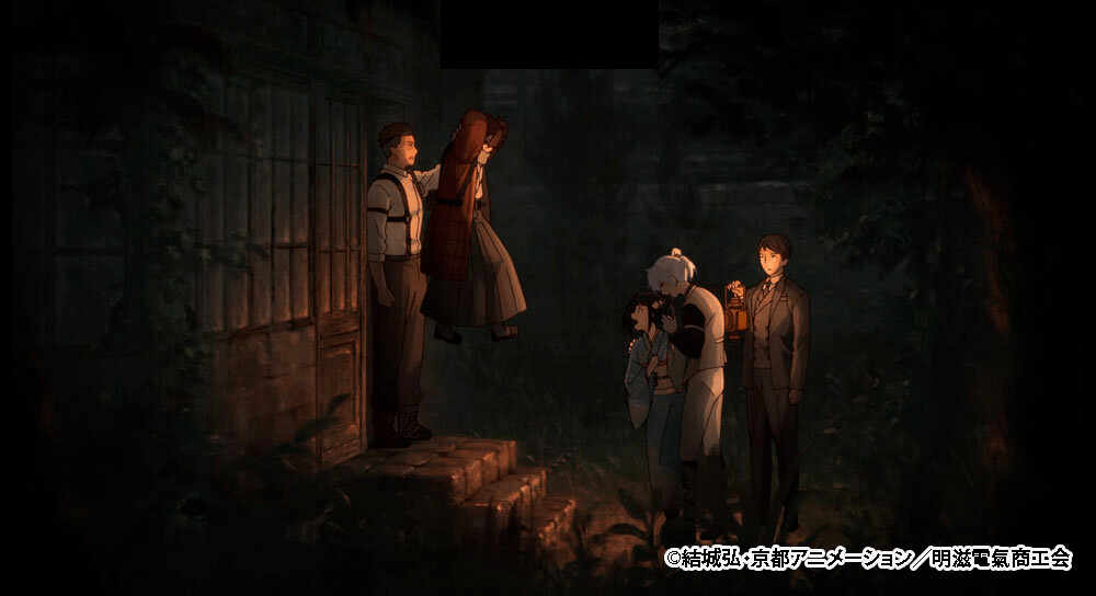
On the flip side, here is an example where adjustments were made to increase the roughness.
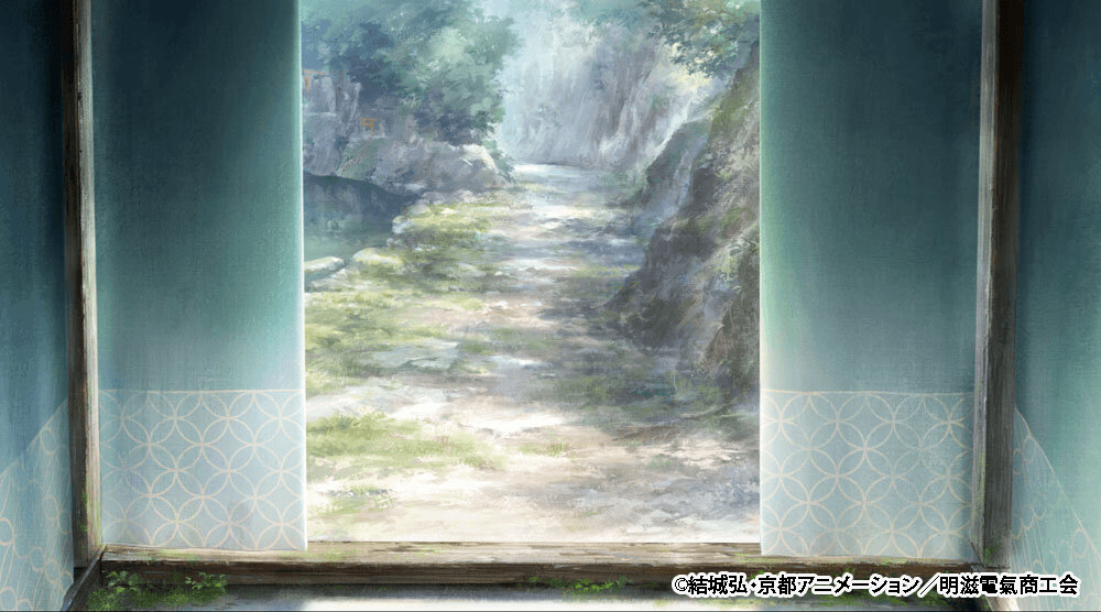
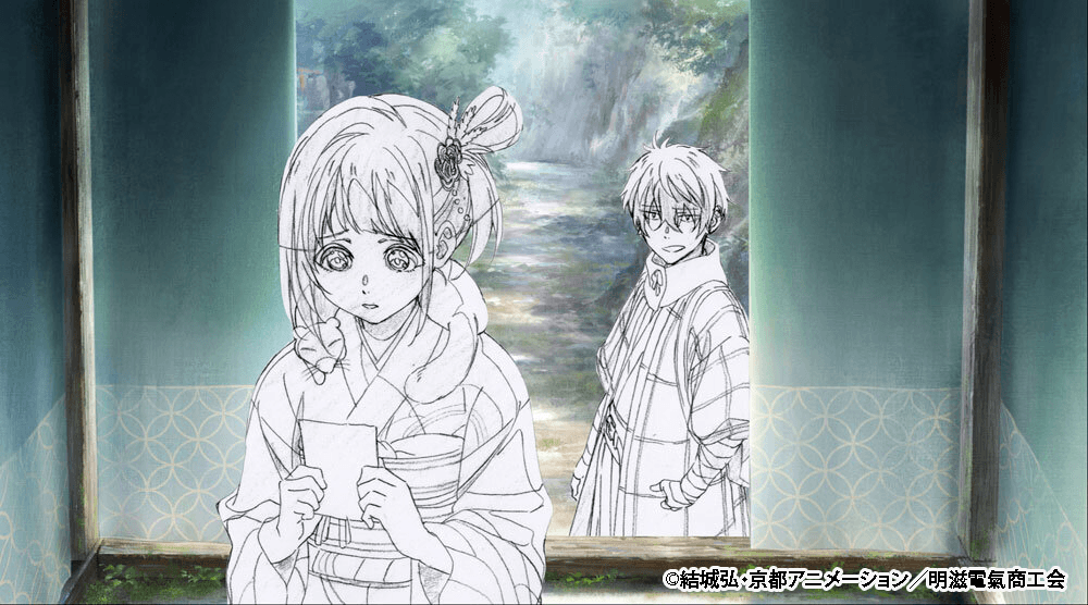
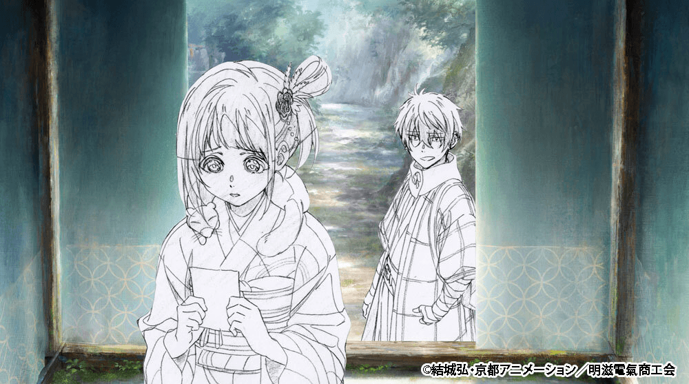
“During the advance test phases, we figured out the criteria for when we needed to add more detail, so once we entered main production, we managed to keep retakes like this down to just a handful of cuts,” Takayama said.
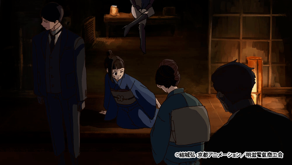
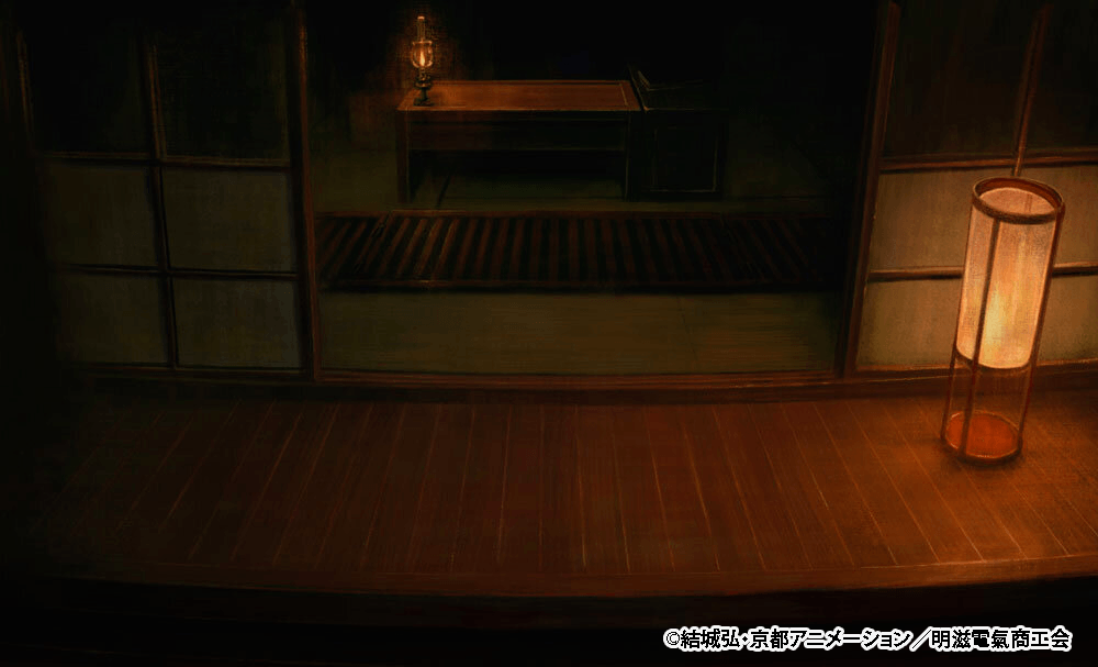
Expressing the Night
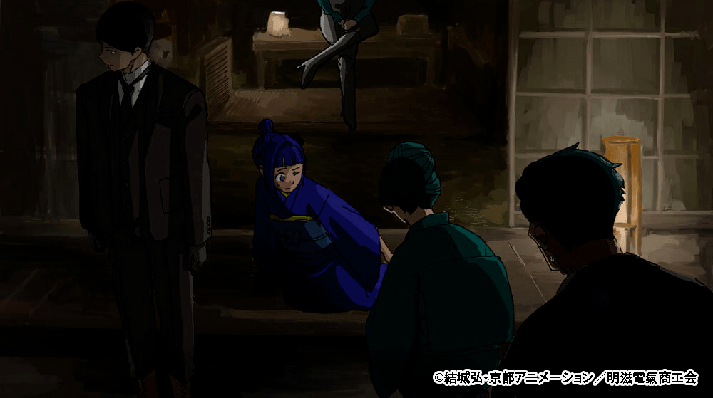
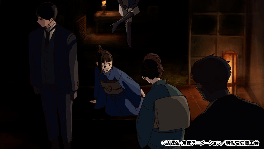
Even with the same painterly finish, the painting method actually changes between day and night scenes. “For the night scenes, we ran into an issue where if we made the painting style too rough, it genuinely became hard to see anything,” Takayama noted.
Expressing the Blue Sky
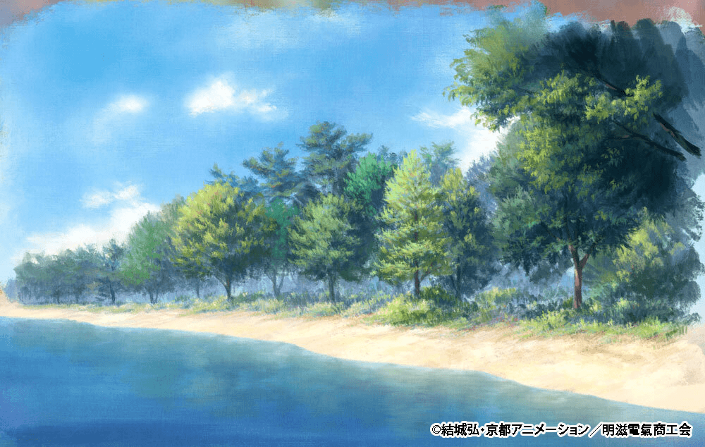
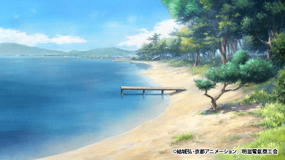
Since this show has a Japanese steampunk aesthetic, the city streets are completely smothered in steam and soot, meaning blue skies are almost never shown. Even when the sky is shown, they carefully chose colors like a blue that heavily leans towards green.
Analog Art Painted with Traditional Paint
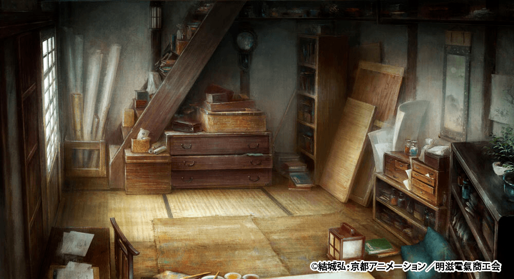
While the art for this show was mostly painted digitally (using Photoshop), traditional paints were also used for some parts. Over at the Kyoto Animation background department, they have a system where newer staff members paint with traditional paints to help level up their skills. For this project, they assigned traditional paint work to specific cuts where it would not look out of place in the final video. Since this show was aiming for a totally different finish than your standard anime background, the staff were asked to paint it quite heavily with thick coats of paint.
Because of speed and the ability to reproduce brushstrokes, they mostly stuck to digital, so traditional painted backgrounds make up just over 10% of the entire show. For each scene, the digitally finished art was created first, and then the analog painters worked to replicate that exact finish. “They did a great job capturing the vibe with traditional paints for indoor scenes and the blurred style art. However, it cannot scream ‘this was painted with real paint’ and clash with the rest of the art, so we would touch it up and add details digitally to finalize it,” Takayama stated.
Backgrounds using 3DCG
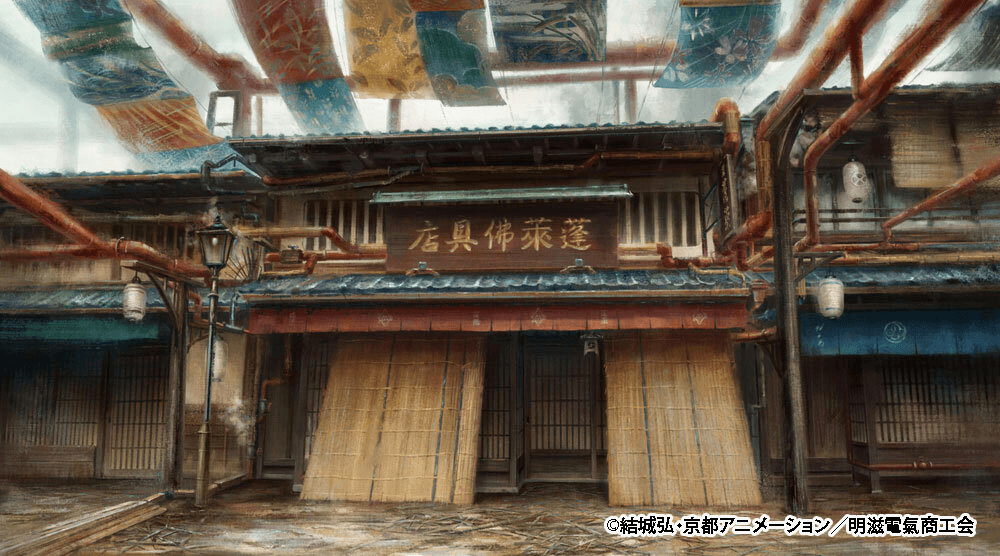
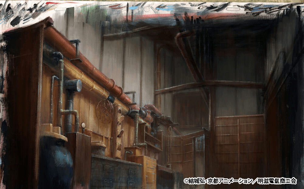
This is 3D art from the perspective of walking down the hallway of the Buddhist altar shop. The big challenge here was figuring out how to express that painterly background style in a 3D space, and this 6-second cut was created as a test run for that. Director Oota asked them to “prioritize a cramped, claustrophobic feeling” while also balancing a desire to “make it look pretty” but also “dusty.”
“We figured that utilizing the hand-painted art exactly as it was would be the most effective method, so we kept the 3D modeling to an absolute minimum. We also mixed in camera mapping for the more complex sections, taking extra care to make sure the background art looked natural and three-dimensional when the camera moved,” explained 3D Background artist Mutsuo Shinohara.
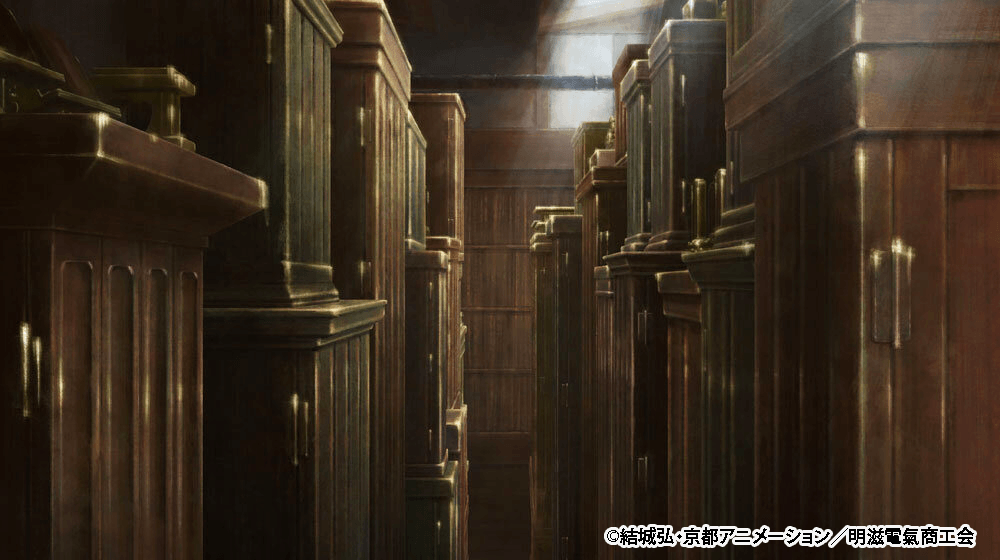
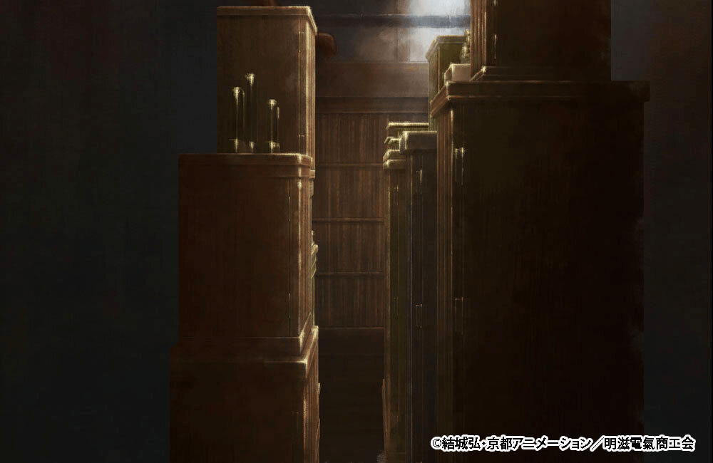
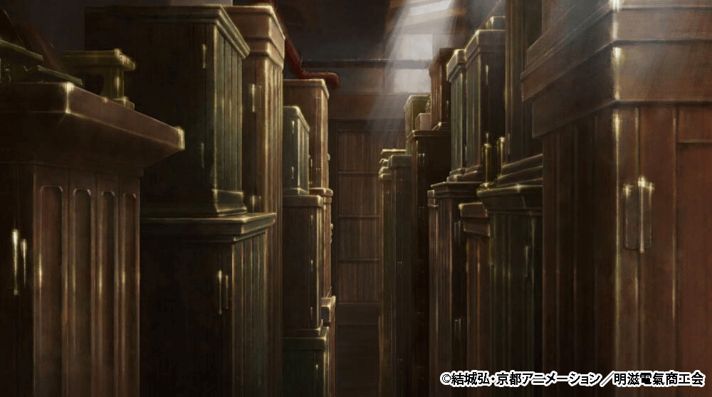
In the finished cut, the character is placed right in the center. The 3D camera angle makes the altar loom into view with zero breathing room, perfectly expressing that “it is so narrow you need a trick just to squeeze past it” vibe.
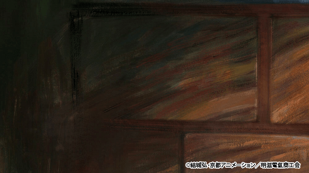
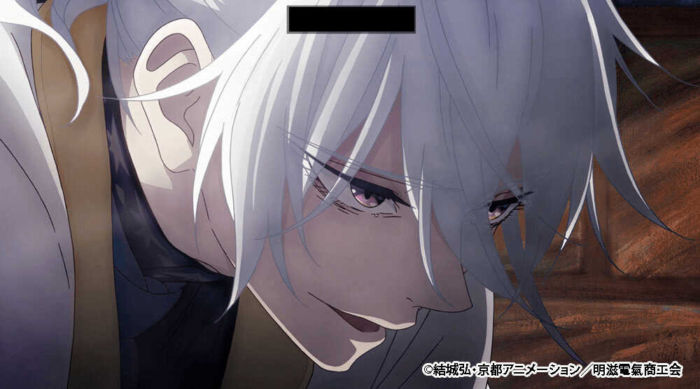
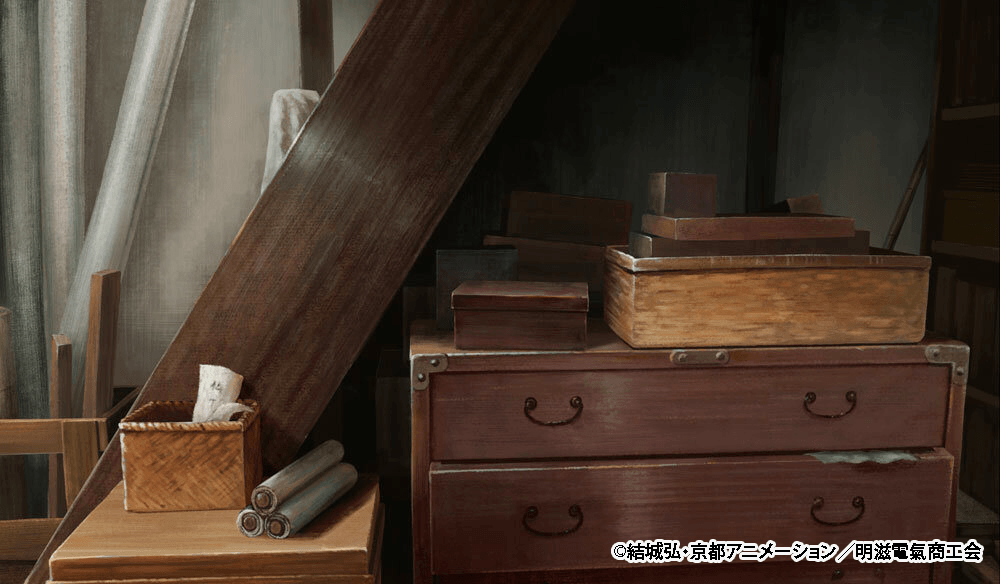
Below is a cut from the first-floor storehouse inside that same Hourai Buddhist Altar Shop. While the technique is exactly the same, the camera angle changes drastically. To keep the characters and the art perfectly matched up at all times, they created rough guides in advance and worked closely alongside the animation and art departments. It is a crucial cut where the camera circles around from the side of the character’s face to the front to focus on their expression, but even within that very 3D-feeling camera movement, every single frame holds up flawlessly as painterly art without looking weird.
“Since it was such an important scene, I had them really polish it to eliminate any disconnect between the background and the characters. Thanks to that, the screen looks incredibly natural,” Director Oota said. “In the end, we managed to get it looking exactly how we aimed for, without the 3D elements standing out too much,” Shinohara added.
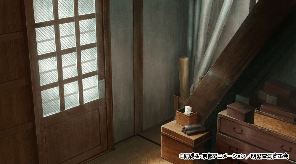
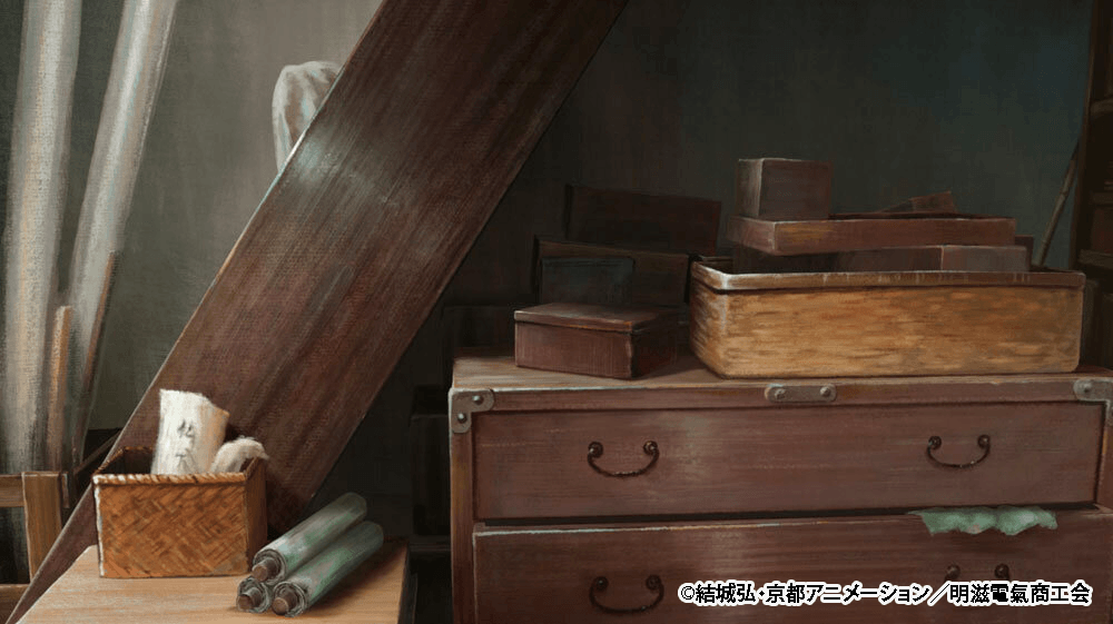
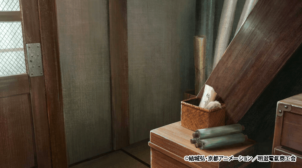
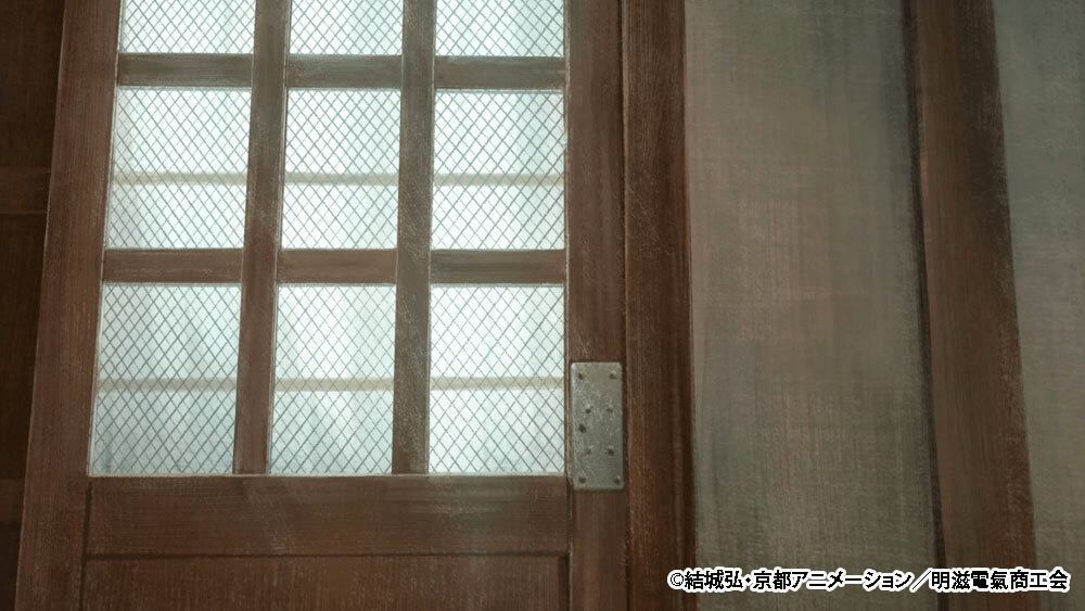
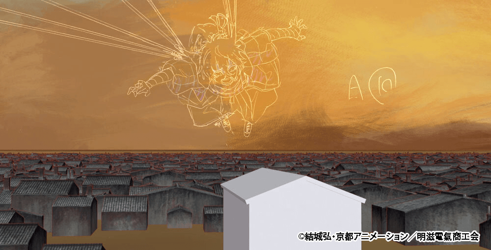
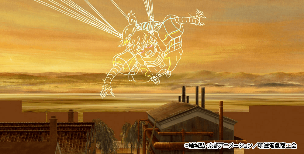
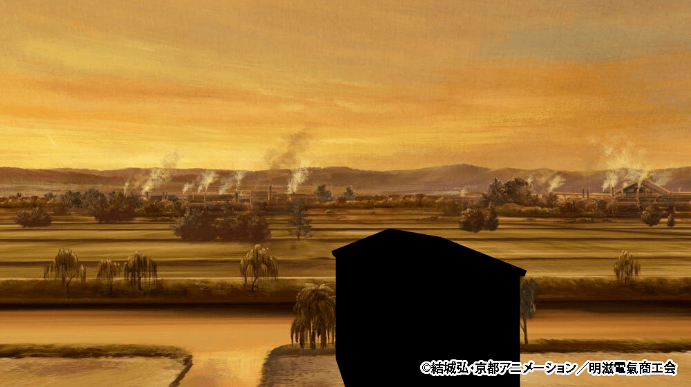
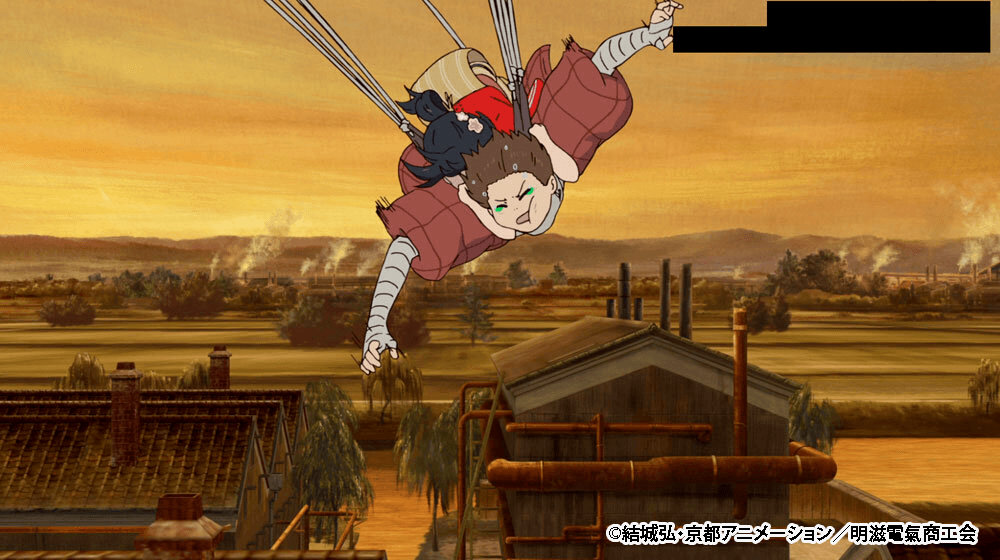
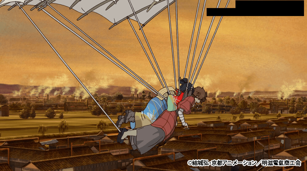
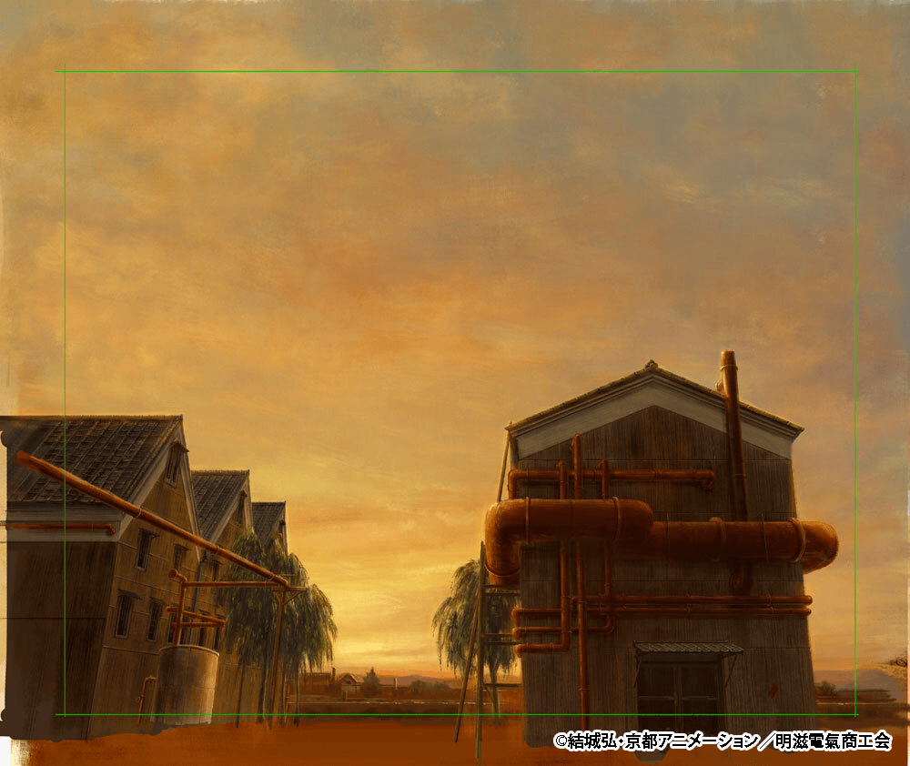
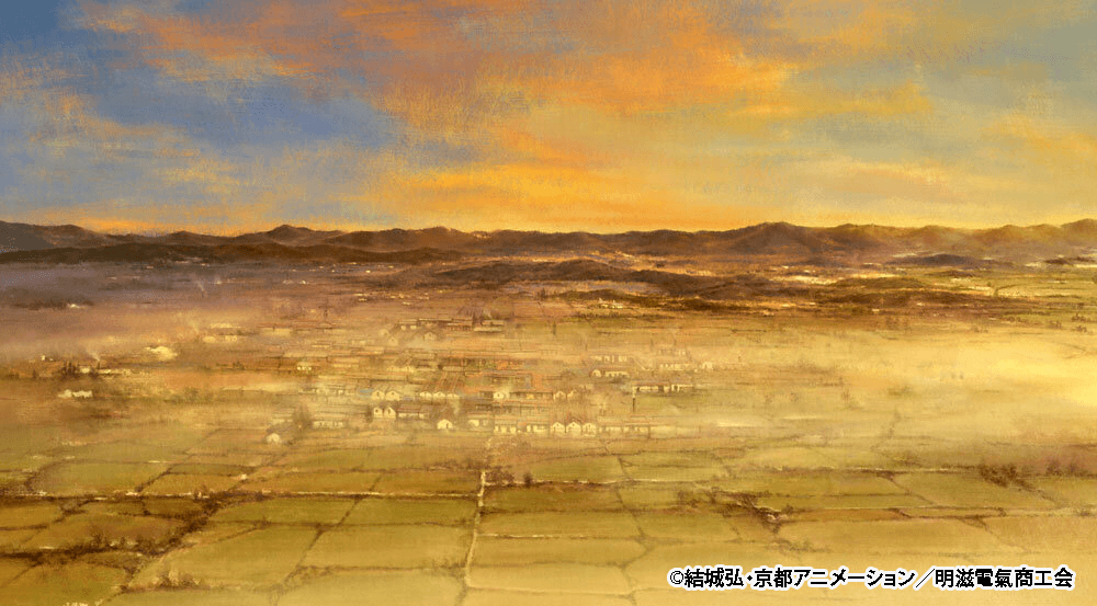
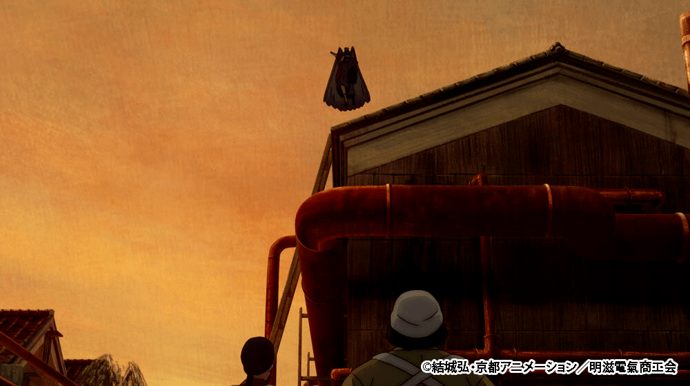
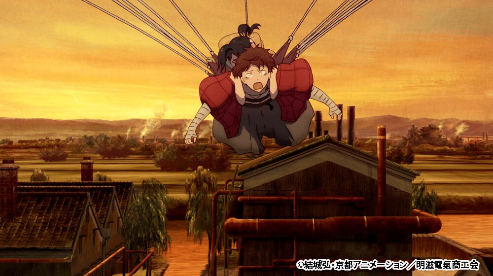
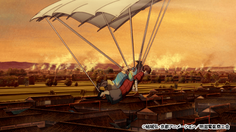
Next up is one of the highlight scenes from Episode 2: the kite flying sequence. For this show, two people from the background department handled 3D background production. Since this scene was so massive, they tackled it together as a duo. On top of that, they even got help from the 3D department for the camera work. “Using old maps of Kyoto as a reference, we had them carefully adjust the size of the rice fields and the buildings in the directions the camera would be facing,” Takayama pointed out.
To be continued in Part 2.
INTERVIEW & TEXT: Hiroyuki Kishimoto
EDIT: Akari Ebihara, Momoko Yamada