Hello everyone, the biggest mystery of my life right now is what monster is causing the endless heatwaves plaguing the British Isles. Except it isn’t a mystery at all, as it’s due to our increasingly chaotic climate going even more out of whack than usual. Back in 1999 however, the UK’s hottest temperature would come on the 2nd August in Hunstanton which reached 32.8C. It’s been over that, about 10 times this year so far.
The Star Detective Precure won’t have to worry about the rising temperatures (yet) but they do have to deal with the rising temperature caused by the impending doom from a Nostradamus prophecy and working out the true identity of Cure Eclair.
Joining us today is Character Designer Akane Yano in Animage as she talks about the character designs for Precure, juggling multiple anime and dropping a few hints on the mystery of Cure Eclair.
Before you ask, she doesn’t talk about the weather in this.
Translation by “nui”, Editing by me – Interview with Character Designer Akane Yano was originally published in Animage in July 2026.
90s style with air intakes and sunken eyes
Interviewer: What were your thoughts when you were chosen to do the character design for this work?
Akane Yano: When I was first offered to pitch for the character design competition, I accepted it feeling like I was buying a lottery ticket! So I didn’t think for a single millimetre that I’d actually be in charge. Then Toei Animation‘s production manager, Naota Hirotaka-san, contacted me saying, “You’ve been selected,” and I was like, “Eh, me, Precure?!?!”
Interviewer: Precure (laughs).
Yano: I thought it was that much of a miracle! (laughs)
Around that time, I was staying overnight at the studio working on another project, but I bolted out to the fire escape and yelled “Yaahoo~!” towards Mt. Fuji. While still holding my mobile phone in the middle of a call, no less. And then I was like, “Yes, Naota-san, thank you very much” (laughs). But right at that moment, I was juggling two other projects as character designer and chief animation director. So while I was thrilled, I also turned pale thinking, “What am I going to do!” But my desire to do it was strong, so I immediately replied, “I’ll do it.”
Interviewer: I heard you’ve wanted to participate in “Precure” for a while.
Yano: Yes, I really wanted to try working on a show for kids. I’ve had a lot of jobs for late-night anime and stuff aimed at anime fans, so I wanted to challenge myself with animation that has a clear, easy-to-understand presentation.
Interviewer: I heard “Purple and Pink Double Protagonists” and “Searching for ‘things'” was decided from the start, but producer Souya Aramaki-san said, “Yano-san’s designs were fully formed from the very beginning.”
Yano: No way, looking at them now they totally aren’t! Sure, the character direction and facial structures haven’t changed from the initial proposal, but the designs gave a much younger impression. I was told, “We want you to raise the target age,” so I adjusted their proportions and brushed up the details on their outfits. By the way, I’m the type to think about the color image at the same time I design, so I submitted them with colors. I did it while thinking, “I see, Purple is finally going to be the main!”
Interviewer: As for the workflow, did you design them starting from their post-transformation (Precure form) which involves the toys, like usual every year?
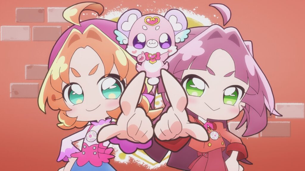
Yano: No, I designed both of them starting from before they transform. Anna, including her everyday clothes and beret, is pretty much exactly as she was in the first design. But Cure Answer changed quite a bit. Since the two main characters are purple and pink, which are similar color families, I thought about how to make them stand out from each other.
Interviewer: In other words, you came up with Anna and Mikuru at the same time?
Yano: Yeah, I thought of them side-by-side, so almost simultaneously. What I submitted to the competition were just three characters: Cure Answer, Anna, and Cure Arcana Shadow. Mikuru’s face initially had a cooler, half-lidded look. But since this is a work for kids, her eyes changed to be wide and bright. Her neat, uniform-like casual clothes haven’t changed much from the beginning.
Interviewer: Starting from their pre-transformation forms is rare in the franchise’s history. Usually, after solidifying the post-transformation which involves the toys, the pre-transformation is made working backward.
Yano: Oh, is that so! For me, a lot of the drama is depicted in their pre-transformation forms, so I wanted to value that. So, when transforming into Cure Answer, I thought about things like, “How should I move Anna’s hair buns?” or “Let’s move those little strands under her buns too, stretch them way out, and make them twin tails.”
Interviewer: After transforming, the two have feather parts attached to their head ornaments. Series Director Kouji Kawasaki-san mentioned that this became the basis for their “inspiration bank” animation.
Yano: They weren’t attached at first, but I was mulling over whether there was something that could act as a little accent. So when I dug up some doodles I’d drawn in the past, I found that when I was little, I used to draw angels and feather motifs a lot. I figured little kids might like that sort of thing. So it was entirely my own personal taste (laughs), but Kawasaki-san and the others incorporated it into the main story and gave it meaning.
Interviewer: Their combination attack “Precure! Flying Spectre!” also has the imagery of a bird flying away.
Yano: They often expanded on things from the designs like that, which makes me super happy. It makes me feel like I’m involved in creating the story in a broad sense, too. I don’t specifically attend the scenario meetings or anything, but there’s a real feeling of creating it together.
Interviewer: Cure Answer’s cape also has a feathery feel. With rounded lines.
Yano: I wanted to express the difference in their personalities there. They’re an odd couple; Anna is the type to act on impulse, while Mikuru is the type to think things through carefully. From “softness” and “hardness,” I brought out their personality differences by giving Cure Answer curves and Cure Mystique straight lines.
Interviewer: Their hairstyles are also wavy and straight.
Yano: Yes. So, Mikuru and Cure Mystique’s hair is blunt-cut, straight hair. The common points in both of their hairstyles are the layered, voluminous look of their bangs and the air intakes (the M-shaped bumps in their bangs).
Interviewer: So you incorporated the 90s anime trends, which is the setting of the work.
Yano: That’s right. Also, along with the air intakes, something I definitely wanted to do was the sunken eyes. If you look from the side, their eyes curve inward.
Interviewer: The eyeballs aren’t spheres, they’re indented, right?
Yano: The anime characters I watched a lot back in the day often looked like this for some reason (laughs). It’s a shape you don’t see much lately, but I think it’s cute, kinda like a figure. I hope adults of our generation (mid-30s) can enjoy it and feel nostalgic, and younger people can enjoy it as something new they’ve never seen before!
Obsession with “sub-colors” and “cheek blush” nails
Interviewer: As a common element, their eyelashes are very long, which is also a bit 90s style.
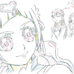
Yano: When you think of Precure, you’ve gotta have those striking eyelashes! Stretching the outer corners of the upper eyelashes straight out is my particular obsession point. I felt that if I stretched all of them out like springs, including the lower lashes, the animation might look a bit messy.
Interviewer: In close-up shots, there are highlights on the eyeliner.
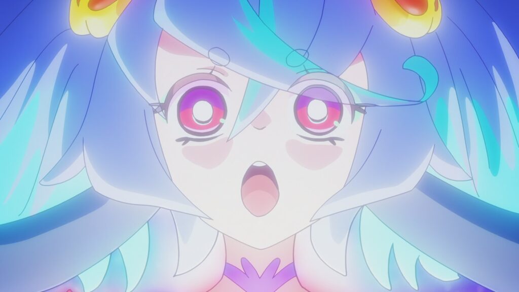
Yano: Right. It’s to express a sparkling reflection in the eyes. If you look closely, this highlight isn’t white, it’s a different color for each character. It’s light purple for Cure Answer and light pink for Cure Mystique.
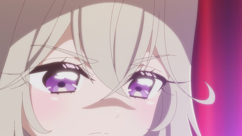
Interviewer: The highlights in the eyes of Precures and fairies have a unique mushroom shape.
Yano: Mushrooms! (laughs) You know how there’s often one big highlight and one small highlight grouped as a set? It’s like I connected them (laughs). Connecting two makes the eyes look a bit more teary and glossy. I wanted to strengthen the impression of the highlights.
Interviewer: On top of that, a little heart accent is added to the Precures’ eyes.
Yano: They said that drastically changing the eye processing between the pre-transformation and post-transformation would honestly make things too hard to control on site, so we decided to put a heart in their eyes when they transform. I thought it would absolutely be cute if you could see a heart during a close-up! The color of the heart is changed for each character to balance with their eye color.
Interviewer: It seems you have quite an obsession with the detailed colors. It’s also characteristic that there’s a rim light-like highlight on the outline of the head.
Yano: I wanted to change the color for the highlights. With Precure, I think there’s a strong tendency to unify everything with one character color, like “If she’s the pink girl, everything is pink!” But I firmly wanted to include a main color and a sub-color. So I went with “Purple and Yellow,” and “Pink and Light Blue.” I had that kind of color separation from the very first design proposal. I felt Cure Answer might give off a dark impression if she was purely purple, so I added yellow to give her a pop feel. To prevent Cure Mystique’s pink from becoming too sweet, I added a refreshing light blue. Plus, light blue is a really trendy color right now. The color designer adjusted it so we could increase the number of colors by using those sub-colors for the highlights and the ribbons on their backs.
Interviewer: Were you also conscious of the blended coloring at the tips of the hair from the design stage?
Yano: Yes, this was something else I wanted to do. Since their hair is long and has volume, it tends to look heavy. Plus, having a different color at the tips is kind of stylish, isn’t it? For example, with animal-eared characters, it’s cute if just the tips of the ears are pink. It’s that kind of vibe. Also, I’ve added a cheek brush to every cut by default. I wondered if it might be bad if it looked too much like a “moe” anime, but when the face is zoomed in on, just having that redness on the cheeks increases the amount of visual information and makes it look lovely.
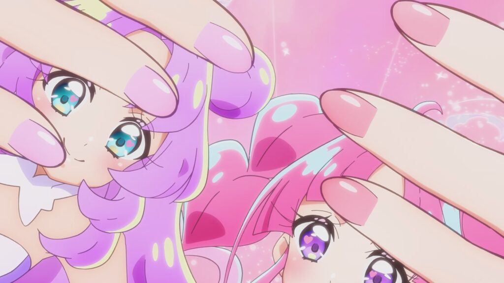
Interviewer: Were the nail colors in the close-ups also there from the first stage?
Yano: Yes, I personally love nails, so I was like, “I want to give them character-colored nails!” Also, in close-up cuts when they’re holding their technique items, I thought it would be easy to tell who it is just by looking at their hands.
Interviewer: The outfits have a ballerina tutu style, but it’s cool how both of them wear fingerless gloves.
Yano: I really wanted to incorporate some coolness. Actually, in the stage of finalizing the design draft, I received instructions to “Please add some sleek, sharp parts.” It’s true that the first design I submitted was a lot fancier and lacked coolness. At first, I had cute cuffs on their wrists, but I dropped those and added gloves instead. I think this really established that “Precure” look.
Wanting to challenge making a pitch-black Precure
Interviewer: I’d also like to ask about Cure Arcana Shadow’s design.
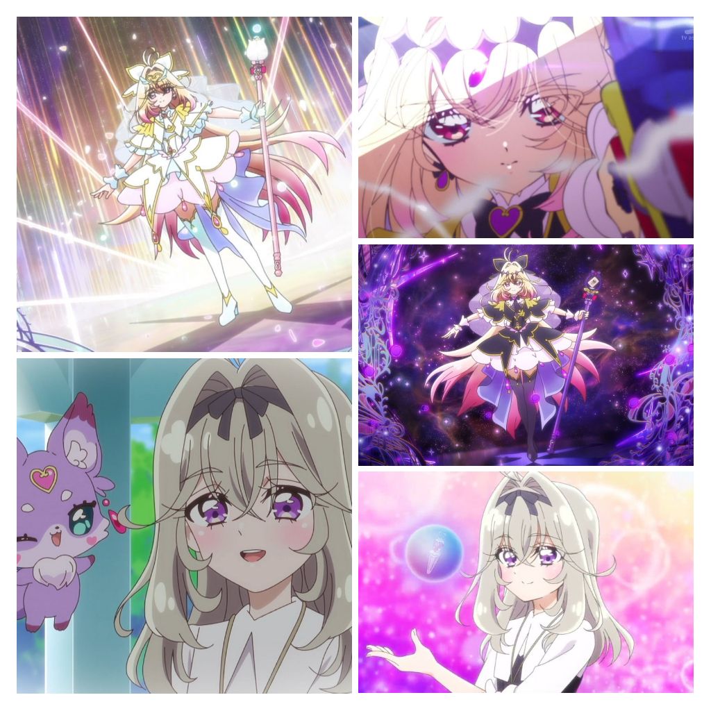
Yano: Her hairstyle hasn’t changed much from the design I submitted for the competition. Her costume is quite different; initially, it had a much more gothic image. The color was extremely black (laughs). That’s how much both Aramaki-san and I felt like, “We’re going to make her black!” From there we made some adjustments, but we managed to keep the “gold on a black background” element. Also, the pink gradient in her hair was there from the start. I wanted to bring out a slightly cute atmosphere. Her long staff is also a characteristic feature, and this was part of the initial order. At the time, she had a different temporary character name, and the head of the staff was spiral-shaped. By the way, for her too, I thought of her pre-transformation form, Ruruka, first.
Interviewer: Did you design the 4th one, Cure Eclair, as a pair with Cure Arcana Shadow?
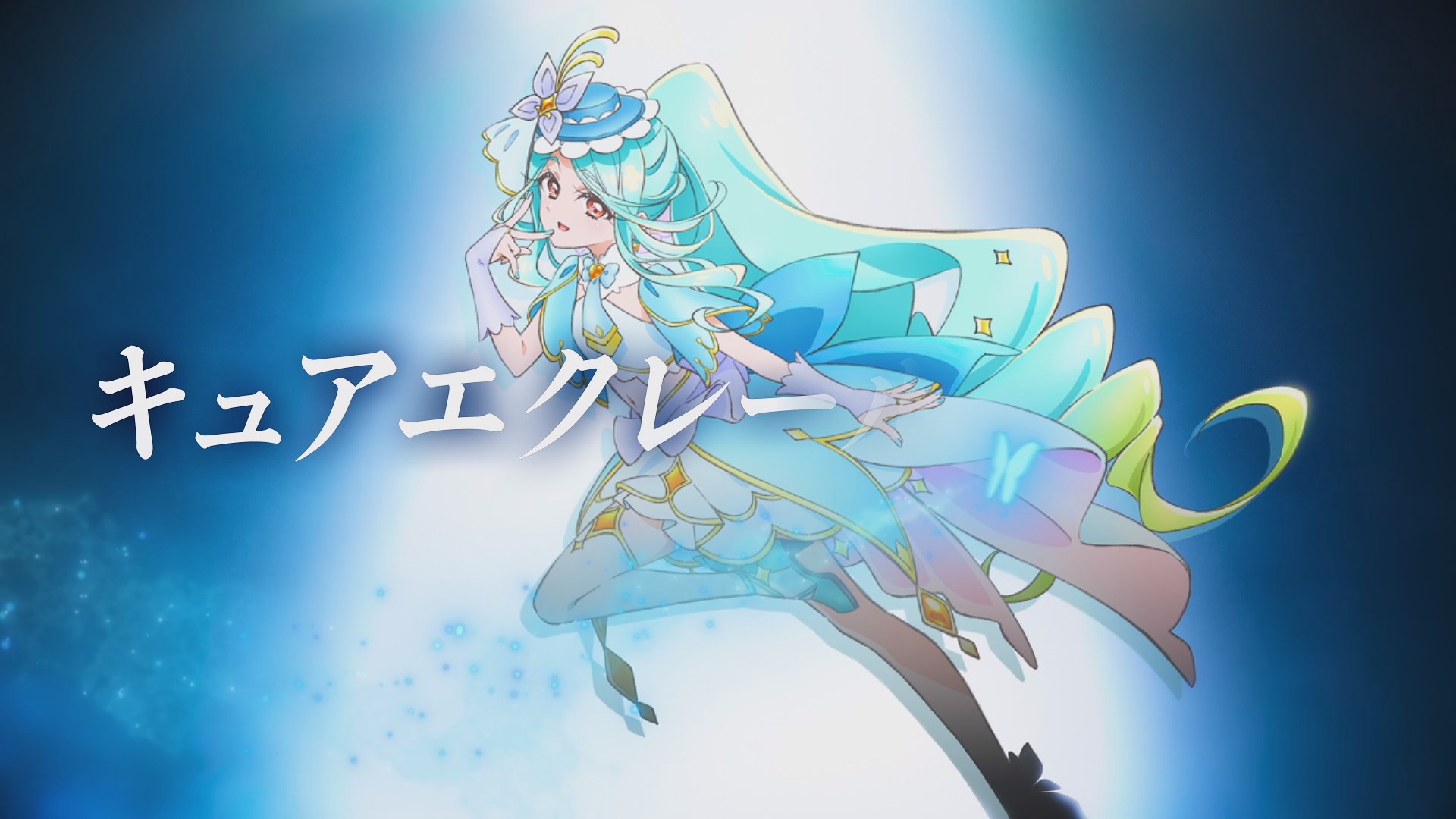
Yano: Not exactly. But they do have butterfly motifs on their heads and parts with similar shapes, so I think they do give off a matching set vibe. As for her, I created her pre-transformation and post-transformation forms almost simultaneously.
Interviewer: Was the butterfly motif there from the request stage?
Yano: No, I just did that on my own. I put butterfly ornaments on her head right from the start.
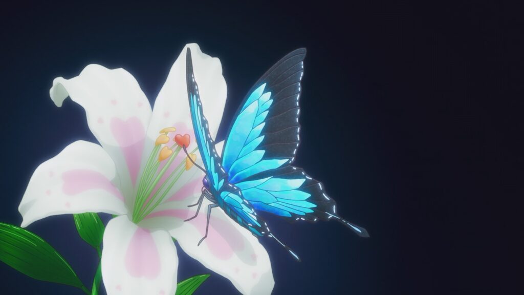
Interviewer: From the opening, blue butterflies appear very symbolically, almost overwhelmingly so.
Yano: That’s probably an influence from my design too (laughs). As for their facial features, in the rough design stage, Cure Arcana Shadow was a soft, mysterious girl type with droopy eyes, and Cure Eclair was a cool older sister with sharp, slanted eyes. However, after listening to what Kawasaki-san and the producers had to say and getting an impression from reading the script, I swapped their eye shapes. The relationship between these two will be depicted in the future, and once you know that, I think you’ll feel that the current eye shapes are a perfect fit!
Interviewer: I’m also looking forward to seeing what happens when the two of them meet face-to-face. Around the time this issue comes out, we’ll be right in the middle of the “Who is Cure Eclair’s true identity!?” campaign. What about the four candidates?
Yano: At first, I just normally created the pre-transformation design for Cure Eclair. The other three are variations of that. I distributed the post-transformation elements among the four of them, and I think it resulted in being well-balanced and scattered nicely. All four of them have a vibe that makes you think, “Could she transform into Cure Eclair?”
Interviewer: In other words, the order was to make the other three look like they “totally seem like they’d transform,” right?
Yano: That’s right. Because of that, I couldn’t stray too far away from the elements of her height, body type, and face, and yet, it was difficult to figure out how to make them “characters from different genres.” The rewarding part was “slightly changing things while using the ‘same elements.'”
Interviewer: When you line the four of them up, they brilliantly have different impressions where you can feel their individual personalities.
Yano: The foundation is the same for all of them, though. But from my perspective, the person who transforms into Cure Eclair really did end up looking similar to her post-transformation form. I was worried that it might be totally obvious to all of you the moment she appeared (laughs).
Interviewer: The shape of the hair highlights is the same for all four of them as it is for Anna and the others, isn’t it?
Yano: That’s right. Roughly speaking, I changed the hair highlights between enemies and allies, giving the enemy side a spiky shape and the ally side a rounded one. Plus, only the main characters have flower-shaped highlights on top of that. I put the same highlights in these four as well.
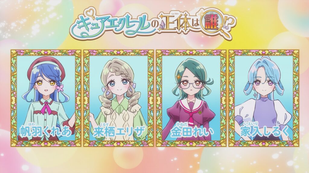
Interviewer: Please tell us the design points for each of the four.
Yano: The novelist Eliza Kurusu is a soft “mori girl” (forest girl). I purposely shifted away a bit from Cure Eclair’s light blue and made her more towards green. Her expressions are also much softer. While keeping the part in her bangs the same as Cure Eclair’s, her braid is a key point.
Interviewer: Shiruku Ieiri is the one whose colors are similar to Cure Eclair, right?
Yano: The feel of her legs and her earrings might have a lot of similar elements to Cure Eclair. However, her expression is sharp, and she gives the impression of having a stronger will. Since she’s an actor, we figured a slightly higher amount of skin exposure would be fine, so we have her showing her stomach.
Interviewer: Rei Kaneda is even sharper.
Yano: Because she’s the student council president, there was an order from the beginning asking me to have her wear glasses. Her diamond-shaped hair accessory and inward-curled hairstyle are made to resemble Cure Eclair.
Interviewer: What about the points for Kurea Howa?
Yano: Since she’s a patissier, I included Cure Eclair’s light blue and gave her chocolate-mint colored clothes. Choco-mint flavor is also really trendy right now. Her hair is tied together near the bottom. Also, I gave her butterfly ornaments to make her look like Cure Eclair.
Interviewer: Finally, please give a message to the fans.
Yano: I was originally a positive person, but once I got involved with “Precure,” Anna and Mikuru were born inside my heart. The two of them talk to me so much inside my head (laughs). Thanks to them, I feel like I’ve become an even more positive person. The power of Precure is amazing! I’d be happy if everyone watches “TanPre” every week and leads a positive life, too!